 This week, I created a chalkboard sign in Photoshop using free downloadable layer styles and various typography. For my design, I chose to create a sign for local Seattle coffee chain (and a personal favorite), Caffe Vita for an upcoming fictitious Valentine’s Day special.
Before I started my project, I added the already-created layer styles simulating a chalk pattern provided by my instructor to my layer styles. I went to my Styles panel and selected “Load Styles.” I then chose one of the instructor-provided chalkboard backgrounds, set at 600 px by 800 px, as the base layer of my sign.
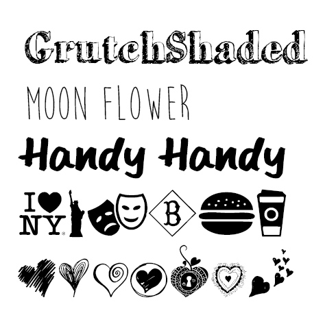
I wanted to use a variety of fun fonts in my design in order to replicate popular chalkboard sign styles, so I canvased my favorite free font website, dafont.com, for new typography. For my text, I chose GrutchShaded (a hip serif for the name of the coffee shop), Moon Flower (a skinny hand-drawn type for that homemade flare), and Handy Handy (an obviously handwritten font to add to the realism of the sign). For consistency, I chose to only use two fonts for the majority of the design.
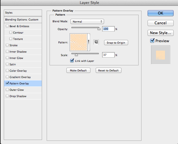
After I typed out my text, I added the chalk pattern layer styles I added to my panel earlier. I went to Window —> Styles to open my panel and went through each layer of text and added a colored chalk pattern. In order to vary the roughness of the chalk, I opened up the Pattern Overlay layer style menu and adjusted the scale of the pattern to fit my desired appearance for some layers.
I wanted to add some pictorial elements to my sign as well. Per my assignment instructions, I was only allowed to introduce pictures by way of wingding fonts. Again, I scoured dafont.com to find wingdings of coffee cups and hearts, to go along with the Valentine’s Day theme. I found New York, New York 2 (‘Z’ is a coffee cup), and heart-themed My Valentine’s Love.
When placing the coffee cups, I did so in two separate layers and flipped one cup horizontally (Edit —> Transform —> Flip Horizontal) in order for them to appear facing one another. I then joined these two layers so I could move and resize both cups at the same time. I also adjusted the scale of the pattern overlay.
When placing the hearts (in this case, “M”) I rotated the pictorial text about 45 degrees and adjusted the scale of the pattern overlay in order to appear like steam rising from the coffee cups.
I placed my instructor-provided decorative ornaments last by going to File —> Place Embedded and resizing the images (and my text) accordingly. I added the chalk pattern layer styles to these layers as well.
Finally, because I had so many different layers of text, I decided to group relevant layers into folders to improve my file organization.
See my final sign below! I really like the overall effect the chalk pattern layer style gave the typography and I think with the right choice of fun and handwritten fonts, the effect comes across fairly realistically. Now to crack how those baristas actually hand-draw those cool signs without any help from Photoshop!


4 thoughts on “A Valentine’s Day chalkboard sign using layer styles & typography”