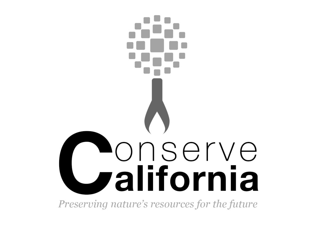
This week, we learned about logo design. Although logos are traditionally created using Illustrator, my instructor brought up a great point: what if (gasp!) you don’t have access to Illustrator? It was certainly a unique challenge but once I had my idea, I bootstrapped Photoshop to make it work.
We were given a choice of client and I chose “Company B”: A non-profit based in Los Angeles dealing in green initiatives and looking to partner with local businesses to spread awareness. After playing with a lot of different word combinations, I settled on the name “Conserve California.”
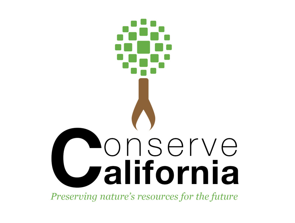
We had overall freedom over the logo design, however we had to include at least one logo mark provided by my instructor. I decided on a combined logo mark and typographical mark, with the logo mark being an image of a tree. I decided on a tree because the image automatically symbolizes the environment. I selected a fragmented ball shape from the logo marks provided to be the leafy top to my tree. The ball just so happened to be green, a color symbolizing health, and in this case, the healthy environment my client is trying to create and preserve. The many different shapes in the mark could represent all the different initiatives my client works on. Also, Los Angeles is notorious for smog, so a leafy green tree is the ultimate symbol for clean air. Overall, I decided a tree would not only be an appropriate symbol, but one that is simple and with timeless meaning.
Because the logo is for print and web, I worked with a 7” x 5” canvas at 300 dpi, to keep the image crisp. This resolution is too high for the web, but Photoshop’s “Save for Web” option helps to correct for that.
I wanted to use Photoshop’s vector graphics as much as possible when designing my logo so that it could be easily resized without losing too much quality. For this reason, I relied mostly on custom shapes. After cropping and clearing the background of my selected logo mark using the magic wand tool, I got to work on the tree trunk and roots. I very much enjoy logos that have hidden symbols (such as the FedEx hidden arrow (see more of these logos here)) because I feel the designer spent extra time thinking about how to make the logo more interesting. For my tree trunk, I used a rounded rectangle and a water drop shape in brown to form the trunk of the tree – the brown color being in the same tone as the logo mark’s green. I then placed a smaller white water drop shape inside the base of the brown one, creating (on a white background) the appearance of curved tree roots. The white water drop essentially becomes the hidden symbol – hinting that my client not only focuses on clean land and air, but also water. When it makes sense, I figure the water drop could be recolored to the color of the background if not white (but not black since that would imply dirty water).
For the word mark portion, I used modern sans serif fonts with clean lines to reflect my streamlined tree: free font, Coolvetica, from dafont.com (a bit more of a modern take on Helvetica) and the thin version of Helvetica Neue. I used the thin font for the word “Conserve” because by the letters being thinner, you are literally conserving ink when printing.
Since my tree is vertically oriented, I decided to follow that direction by placing my word mark below the tree (however it could go to the right of the tree if a horizontal orientation is needed). I chose to share one letter ‘C’ between the words ‘Conserve’ and ‘California’ for two reasons: stacking the text in this way offers a contemporary feel (I adjusted the leading and kerning to align them just right) and by using just one ‘C’ instead of two, you are “conserving” C’s. This represents saving natural resources since ‘C’ is the chemical element for carbon and reducing carbon emissions is a hot topic in the green industry.
I created a tagline I felt would encompass all of my client’s green initiatives, current and future, by not focusing on one specific campaign, but on my client’s overall goal: “Preserving nature’s resources for the future.” I believe my logo is general enough for use in the green industry in order to stay relevant, even if the tagline changes.
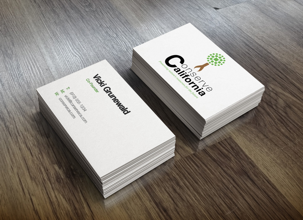
Since my logo is fairly simply and uses smooth typography and minimal colors, I believe my logo will work well in a variety of formats, including in small form on business cards, on the web, embroidered on shirts, on a dark background or in grayscale. I resized my logo to a very small size to see what it would look like and I think the tree by itself would be effective as a favicon or app icon.
As long as my client’s business stays within the realms of the green industry, I believe my logo would hold up, however outside of that, I’m not sure if the meaning behind the tree symbol would carry. Their company name is “Conserve California” so if they do decide to conduct business outside of the green industry, I’m sure they’ll need a complete rebrand, not just a new logo.


