Disclaimer: This blog and its author are not affiliated with Epicurious in any way. Designs featuring their likeness are for educational use only.
This week, we discussed integrated marketing communication (IMC), a brand’s development and execution of a cohesive multi-channel identity campaign that immerses the target consumer in a consistent experience every time they encounter the brand. In this week’s assignment, I am highlighting the new visual IMC campaign launched this week by Epicurious, a recipe website owned by Condé Nast.
I really like using Epicurious to help find new recipes and I always enjoy the expert cooking tips they provide for those trickier dishes. Their previous website was pretty cluttered, a little bit too much for the user to focus on at one time. This week, Epicurious relaunched their entire brand, including a new, better website, promoting it across multiple platforms including social media and magazine advertising. Instead of just being a recipe website, Epicurious wants to be known as a “food utility” — an invaluable tool for home cooks to not only find new recipes, but to be inspired to push themselves to try even more.
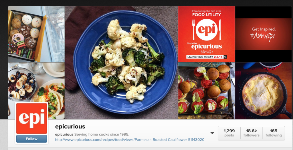
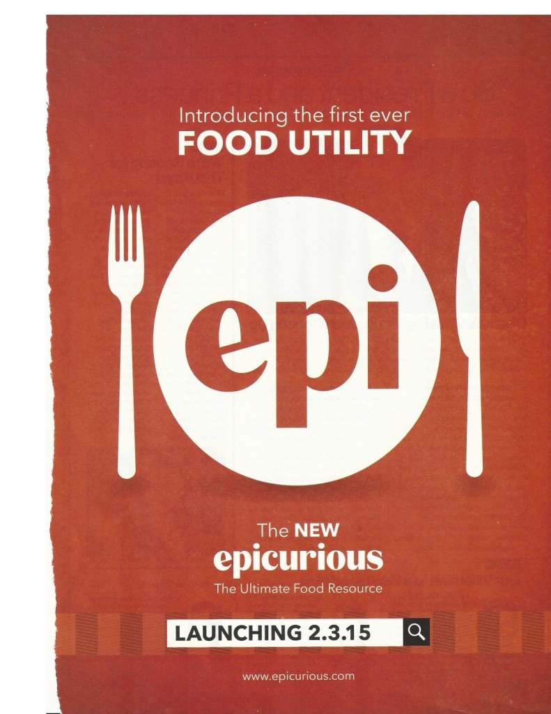
Epicurious’s visual IMC campaign features this message and refreshed new logo. For consistency purposes, the brand chose to keep with their same color palette of red and white. Not only did they post a detailed article on their rebranding on their website, Epicurious also posted the announcement and new logo to their Facebook, Twitter, and Instagram pages.
The inspiration for my own Epicurious web advertisement came from a print ad they placed in Glamour magazine and a promotional video they created for the rebrand posted to their social media.
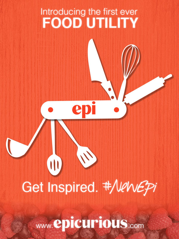
In my own web advertisement, I wanted to play off the branded message that Epicurious is more than just a recipe website, they are a valuable all-in-one resource – a “food utility.” When I thought of the word ‘utility,’ I thought of another all-in-one tool, a swiss army knife. This image became the basis of my design.
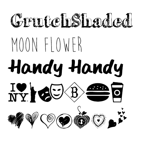
I started with a red background, sampled with the eye dropper from the Epicurious logo. To make my version of a swiss army knife, I created the custom shape in Illustrator for the handle. I then copied this shape into Photoshop. For its tools, I used a free cooking themed set of wingdings called Cocinitas (from dafont.com). I placed each cooking icon on its own layer and rotated and resized accordingly. I also converted each letter layer into a shape layer so they could be resized without having to adjust font size. Because I could not find a good high-resolution image of the Epicurious “epi” logo, I traced it in Illustrator before placing it into Photoshop. I then added two circles to form the handle screws. I selected all of the layers involved in the swiss army knife and linked the layers so I can resize them all at the same time. Finally, I added drop shadows to the handle and tools to add depth. I kept the shapes white, to keep consistent with the print ad.
I then began to place the text. For the top message (“Introducing the first ever FOOD UTILITY”) I used Helvetica, the same font used in the original ad, in order to keep visual consistency. I took the bottom slogan (“Get Inspired. #NewEpi”) from their video. I was also able to use the same typography here, Helvetica and a free font, Southpaw, from dafont.com.
For the footer text, the full Epicurious logo, I found a larger image that I placed into Photoshop, however I had to select the background of this logo with the magic wand tool and discard it since the color did not exactly match my existing background. I then tried to clean up the white lettering of the logo by using the Sharpen Filter, and by using the paint bucket tool to fill in the lettering with more white. For all of the actual text in my advertisement, I added a slight Outer Glow effect so it appeared brighter against the red background.
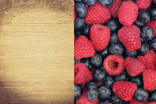
Finally, I wanted to add some texture to the background. I started with a high resolution wood background image from Flickr and placed this behind my red background. I then added a layer mask to the red background layer and shaded in grey so to appear opaque, revealing the texture of the wood below.
To make the footer appear more interesting, I added another layer between the red and wood backgrounds with an image of berries (from Flickr) and added a mask with a black/white gradient so the berries would appear to fade into the wood. To improve the blending of the wood and the berries, I applied a Desaturate style to the berry layer and adjusted the opacity of the mask on the red background where the berries show through.
By keeping the messaging, color scheme, typography and general design consistent, I believe my advertisement would fit in well with the current Epicurious integrated marketing campaign. In my opinion, it may even better illustrate the message that their website is meant to be an invaluable tool to all home cooks, not just another recipe website.

