Creating infographics in Photoshop, with a little help from the pen tool

Disclaimer: This blog and its author are not affiliated with ThinkProgress in any way. Designs featuring their likeness are for educational use only.


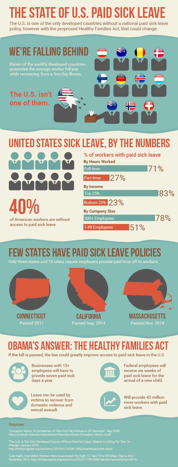
I think this week’s assignment was the most challenging yet. This week, I created an infographic based on an article by ThinkProgress, “The U.S. Is The Only Developed Country Without Paid Sick Days. Obama Is Calling For That To Change.” The article discusses the proposed Healthy Families Act as well as the current state of paid sick leave access in the U.S. In summary, the U.S. does not have a good reputation for paid sick leave, with many working Americans having no paid sick leave at all. The Healthy Families Act would try to improve on this issue.

Before I opened Photoshop, I first read through the article, as well as several other affiliated articles that were linked to in the original, including a brief research study on paid sick leave in the U.S. There were a lot of statistics referenced throughout these articles, and it was difficult to choose which points would work well for my infographic. I decided to focus on the current state of paid sick leave in the U.S. and after printing out the articles I wanted, highlighted the core facts I wanted to include. I wanted my infographic to give a well-rounded overview on paid sick leave in the U.S. so I focused on a few facts I thought would best fit this purpose.

I then sought out inspiration on Pinterest, looking for infographics and graphic elements I liked. Afterwards, I drew a very rough wireframe of my design so I could stay focused when designing in Photoshop. To determine the dimensions of my infographic, I actually found an infographic about that very topic. While there are no real set dimensions for infographics, I chose the common width of 600 px. I then started with a height of 1000 px but extended my canvas as needed.

The infographics I liked had a clear organization, with different sets of data or topics separated by boxes or borders. I decided to separate my design into six parts: the header, a section comparing the U.S. to other countries, a section on U.S. statistics, a section on existing state laws, a section describing the proposed new law, and finally a section for my sources. I used two different background fills to distinguish these different sections.

I wanted to display my data in a variety of ways in order to keep the infographic visually interesting, but also to illustrate each set of data in an appropriate way I used human figures and flags to display different countries. I used bar charts to illustrate comparative percentage stats. I also used simple images and icons to highlight short snippets of information about state laws and the new proposed Healthy Families Act. Each section is distinctively different in data display, however the consistent typography and color palette helps to provide consistency throughout. I also ordered my sections in a way I thought made sense and told the story of paid sick leave in the U.S., starting with the big international picture and moving into more and more details, first at the national level and then the state.

I used the pen tool to add character to my infographic through the use of custom shapes. In Illustrator, I created my simple worker figures used in my second section so I could use the Pathfinder panel to merge the shapes. Once I moved those figures into Photoshop, I added some fun extras with the pen tool, including the wet sneeze from Ms. United States, and the tissue box Mr. New Zealand so helpfully provides. I also used the pen tool to create my blue background boxes with the uneven borders. I believe these boxes, instead of basic rectangles, adds depth and another element of interest to the overall graphic.

Grunewald_DesignShowcase14

Designing an original moodboard for StreetTreks.com

Screen Shot 2015-02-18 at 2.16.04 PM

This week, I designed a moodboard for a brand/website I will be developing in another graduate class: StreetTreks.com. The idea behind Street Treks is to create a series of informative, fun and easy-to-use self-guided walking tours of a particular city so residents, especially those new to the area, can explore all of the unique neighborhoods and see everything their city has to offer. Besides promoting new experiences, my website will also promote an alternative activity to traditional hiking. While Seattle offers many mountainous trails, the city sidewalks can take you to views just as breathtaking.

Street Treks will be a website that combines both the rugged, earthy aesthetic of traditional hiking with the sleek and modern feel of the city. To convey this feeling, I designed my moodboard with a natural color palette, contrasting rustic with city images and mixing sleek and handwritten fonts.

Before I began my board, I searched for stock photography that fit my theme. I used Unsplash and pexels.com, as well as a few other resources that can be found here.

I loosely used this tutorial to help design the layout of my moodboard using the rectangle shape tool. I used my grid and guides to help with even spacing between boxes. Once I had a layout I liked, I placed my images and applied them as clipping masks to each rectangle so each box acted as a frame. Once all images were placed, I added image adjustments to various image layers as needed, including photo filters to help cool the tone of warmer images, and decreased brightness to correct washed-out images. Because my images are embedded as smart objects, I had to double-click each image to open it as a separate file, make edits and save.

Per the project instructions, I needed to incorporate three Pantone colors of the year into my board. To add 2015’s Marsala, I selected the image of the woman holding a camera and used the color replacement brush at a high tolerance to change the color of her watch, fingernails, and bracelet. To add 2013’s Emerald, I selected the image of the woman wearing hiking boots and used the color replacement brush to change the color of her jeans from grey to green.

Pantone Colors of the Year

Finally, to incorporate 2006’s Sand Dollar, I took the image of a grayscale city skyline and added a layer of the color above the image using a “Multiply” blend mode, tinting the overall image.

skylinebefore

Original image

Skylineafter

Sand Dollar layer applied

The last image adjustment made was to the image of the woman holding the camera. I found a free downloadable Photoshop action called “Portrait Action” and applied it to my image. The action helps desaturate an image and comes in two parts. A couple steps must be manually done in-between Parts 1 and 2 as indicated in the instructions.

cameragirlmarsalabefore

Original Photo

cameragirlmarsalaafter

After Color Replacement and Portrait Action

I added two sets of text, one in modern “Coolvetica” and the other in handmade “Moon Flower Bold,” both free from dafont.com. I purposefully tried to create a contrast by placing the more modern font on a rugged image, with the rougher handmade font on the modern city skyline. I also added a few dashed boxes and compass custom shapes to make the board more interesting and balance the white text. Finally, I added a color palette sampler that I felt reflected both the natural and city beauty of Seattle.

I like to think my final moodboard conveys to the viewer the StreetTreks.com goal: to take the scenic and woodsy activity of hiking and apply it to the city you’re already living in. A forested mountain hike isn’t always close by, but a city hike, exploring new neighborhoods and discovering new viewpoints, can be right outside your front door. So bring your camera, and your map (to be provided digitally by StreetTreks.com, of course) and start trekking!

Grunewald_DesignShowcase7