Creating infographics in Photoshop, with a little help from the pen tool

Disclaimer: This blog and its author are not affiliated with ThinkProgress in any way. Designs featuring their likeness are for educational use only.


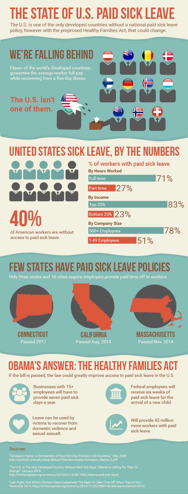
I think this week’s assignment was the most challenging yet. This week, I created an infographic based on an article by ThinkProgress, “The U.S. Is The Only Developed Country Without Paid Sick Days. Obama Is Calling For That To Change.” The article discusses the proposed Healthy Families Act as well as the current state of paid sick leave access in the U.S. In summary, the U.S. does not have a good reputation for paid sick leave, with many working Americans having no paid sick leave at all. The Healthy Families Act would try to improve on this issue.

Before I opened Photoshop, I first read through the article, as well as several other affiliated articles that were linked to in the original, including a brief research study on paid sick leave in the U.S. There were a lot of statistics referenced throughout these articles, and it was difficult to choose which points would work well for my infographic. I decided to focus on the current state of paid sick leave in the U.S. and after printing out the articles I wanted, highlighted the core facts I wanted to include. I wanted my infographic to give a well-rounded overview on paid sick leave in the U.S. so I focused on a few facts I thought would best fit this purpose.

I then sought out inspiration on Pinterest, looking for infographics and graphic elements I liked. Afterwards, I drew a very rough wireframe of my design so I could stay focused when designing in Photoshop. To determine the dimensions of my infographic, I actually found an infographic about that very topic. While there are no real set dimensions for infographics, I chose the common width of 600 px. I then started with a height of 1000 px but extended my canvas as needed.

The infographics I liked had a clear organization, with different sets of data or topics separated by boxes or borders. I decided to separate my design into six parts: the header, a section comparing the U.S. to other countries, a section on U.S. statistics, a section on existing state laws, a section describing the proposed new law, and finally a section for my sources. I used two different background fills to distinguish these different sections.

I wanted to display my data in a variety of ways in order to keep the infographic visually interesting, but also to illustrate each set of data in an appropriate way I used human figures and flags to display different countries. I used bar charts to illustrate comparative percentage stats. I also used simple images and icons to highlight short snippets of information about state laws and the new proposed Healthy Families Act. Each section is distinctively different in data display, however the consistent typography and color palette helps to provide consistency throughout. I also ordered my sections in a way I thought made sense and told the story of paid sick leave in the U.S., starting with the big international picture and moving into more and more details, first at the national level and then the state.

I used the pen tool to add character to my infographic through the use of custom shapes. In Illustrator, I created my simple worker figures used in my second section so I could use the Pathfinder panel to merge the shapes. Once I moved those figures into Photoshop, I added some fun extras with the pen tool, including the wet sneeze from Ms. United States, and the tissue box Mr. New Zealand so helpfully provides. I also used the pen tool to create my blue background boxes with the uneven borders. I believe these boxes, instead of basic rectangles, adds depth and another element of interest to the overall graphic.

Grunewald_DesignShowcase14

Editing video and adding graphics and animation in Photoshop

Disclaimer: This blog and its author are not affiliated with Ojai Olive Oil Company in any way. Designs featuring their likeness are for educational use only.


This week, I edited video for the first time and I did so in Photoshop. Before this week, I didn’t even know you could edit video in Photoshop, so I was impressed with the number of features and fair ease of use. I followed this lynda.com tutorial to edit the provided video. The video features the founder of Ojai Olive Oil Company discussing the history of his farm’s olive grove and the olive oil production process. There is a lot of beautiful scenery throughout however the speaking portion of the piece is pretty dry and the accompanying soundtrack is a little hokey. The video and audio are provided on a single track, so unfortunately, the music had to stay.

I first edited the video to shorten its length. The original video is about two minutes long. According to an article posted on The Next Web, testimonial or “talking head” videos should be between 60 and 119 seconds in length for marketing purposes so that it will appeal to a wider audience online than just those who really want to learn more about the company. I edited out some superfluous frames from the start so that my opening screen – the first thing consumers see when they come across the video – is intriguing with the image of a sign pointing the way to learn more about Ojai Olive Oil.  I also cut out the entire second portion of the video that discussed the olive oil production process since the video cuts off in the middle of the description. After editing my video, it’s now 68 seconds.

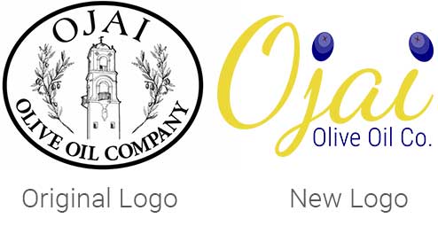
I created a new logo for the company to include in the video since their current logo is outdated and not very flexible since it includes very detailed imagery. I updated the logo with new typography (Dancing Script and Roboto Condensed from Google Fonts) and included the brighter colors from their website color palette – deep blue and gold – for a more contemporary design. I created a couple olives in Illustrator and brought them into Photoshop to dot the i’s in “Ojai.” For my title screen, I faded the logo in on a semi-transparent background and then changed the logo style and opacity to move it into the bottom right corner of the screen for the majority of the video – this is called an ID bug. I also faded in a brief line of text to describe the contents of the video – “About Our Ojai Farm.”

logos

For the founder’s interview, I included a feathered, semi-transparent lower-third in gold with the gentleman’s name and title to give him credibility. I moved and faded out the lower third once he was off-screen so the viewer could take in all of the gorgeous scenery featured at this point in the video.

To end the video, I faded out the founder as he wraps up a discussion on the colors of ripening olives. As a cute transition between the interview and the closing slide, I created a separate, taller layer scattered with the olives I created for the logo and triggered an animation to show them falling down the screen. This then fades into the now full-color logo and company contact information.

Overall, after I understood how the animation tools worked, I enjoyed using Photoshop for basic video editing and animation. I also see how video editing can become extremely time consuming, editing out frames and adjusting fades and effects by the tenth of a second. The animation I played with is fairly smooth, but I believe for motions more complex than simple direct movements or rotations across the screen, Photoshop probably isn’t the best program.

Understanding Integrated Marketing Communication by creating my own web ad

Disclaimer: This blog and its author are not affiliated with Epicurious in any way. Designs featuring their likeness are for educational use only. 


This week, we discussed integrated marketing communication (IMC), a brand’s development and execution of a cohesive multi-channel identity campaign that immerses the target consumer in a consistent experience every time they encounter the brand. In this week’s assignment, I am highlighting the new visual IMC campaign launched this week by Epicurious, a recipe website owned by Condé Nast.

I really like using Epicurious to help find new recipes and I always enjoy the expert cooking tips they provide for those trickier dishes. Their previous website was pretty cluttered, a little bit too much for the user to focus on at one time. This week, Epicurious relaunched their entire brand, including a new, better website, promoting it across multiple platforms including social media and magazine advertising. Instead of just being a recipe website, Epicurious wants to be known as a “food utility” — an invaluable tool for home cooks to not only find new recipes, but to be inspired to push themselves to try even more.

Logos

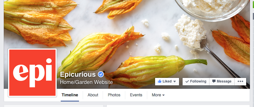
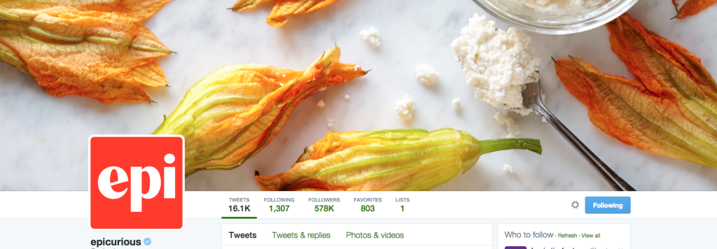
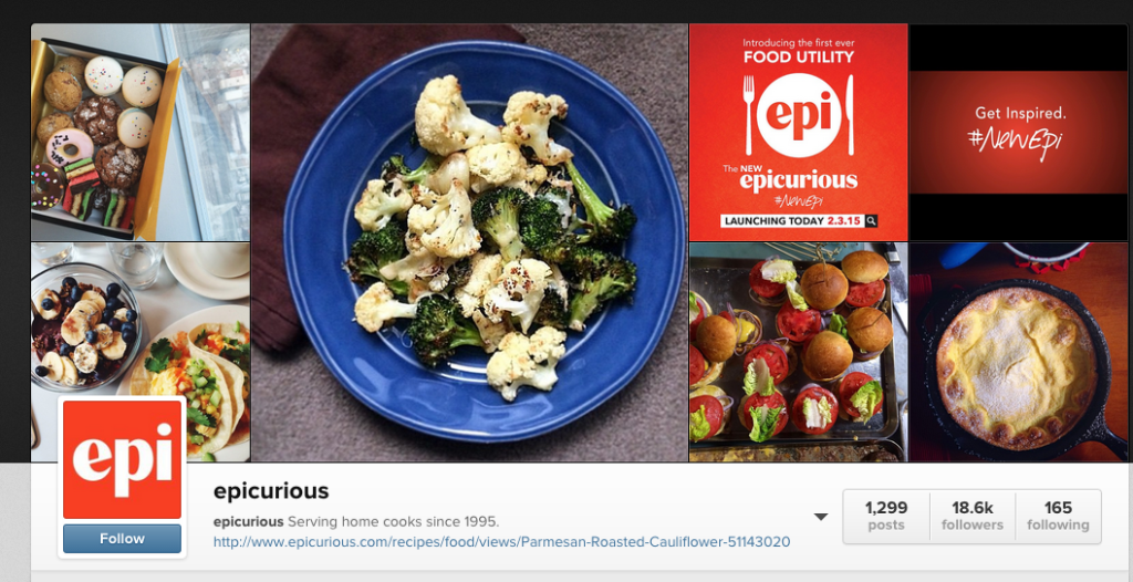
Epicurious’s visual IMC campaign features this message and refreshed new logo. For consistency purposes, the brand chose to keep with their same color palette of red and white. Not only did they post a detailed article on their rebranding on their website, Epicurious also posted the announcement and new logo to their Facebook, Twitter, and Instagram pages. 

Screen Shot 2015-02-06 at 10.02.34 AM

Screen Shot 2015-02-06 at 10.03.00 AMScreen Shot 2015-02-06 at 10.03.31 AM

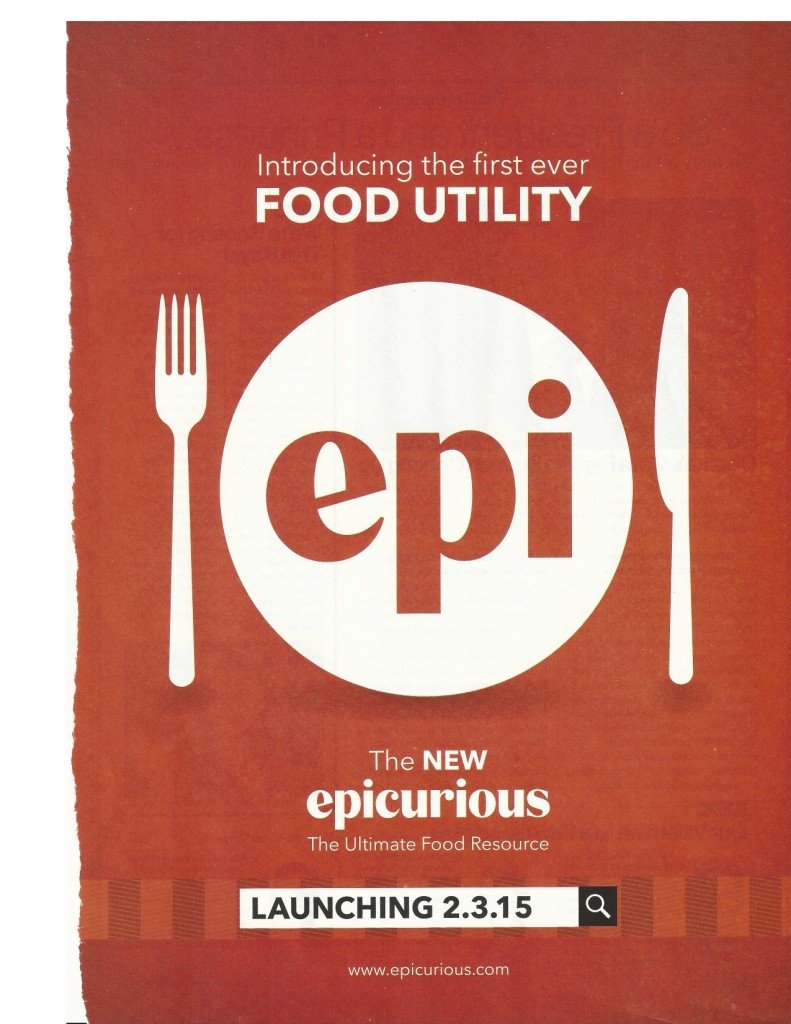
The inspiration for my own Epicurious web advertisement came from a print ad they placed in Glamour magazine and a promotional video they created for the rebrand posted to their social media.

magazinead

Full-page ad in February 2015 Glamour magazine


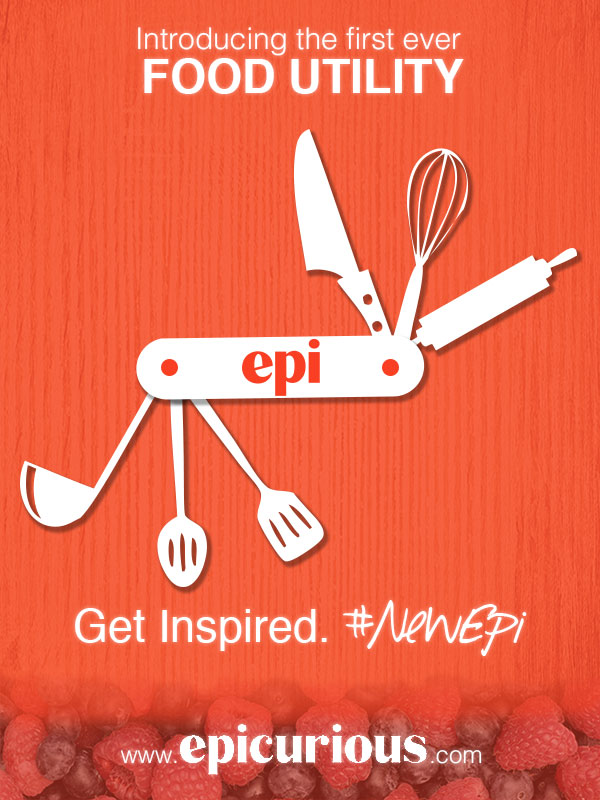
In my own web advertisement, I wanted to play off the branded message that Epicurious is more than just a recipe website, they are a valuable all-in-one resource – a “food utility.” When I thought of the word ‘utility,’ I thought of another all-in-one tool, a swiss army knife. This image became the basis of my design.

I started with a red background, sampled with the eye dropper from the Epicurious logo. To make my version of a swiss army knife, I created the custom shape in Illustrator for the handle. I then copied this shape into Photoshop. For its tools, I used a free cooking themed set of wingdings called Cocinitas (from dafont.com). I placed each cooking icon on its own layer and rotated and resized accordingly. I also converted each letter layer into a shape layer so they could be resized without having to adjust font size. Because I could not find a good high-resolution image of the Epicurious “epi” logo, I traced it in Illustrator before placing it into Photoshop. I then added two circles to form the handle screws. I selected all of the layers involved in the swiss army knife and linked the layers so I can resize them all at the same time. Finally, I added drop shadows to the handle and tools to add depth. I kept the shapes white, to keep consistent with the print ad.

Screen Shot 2015-02-06 at 10.44.06 AM

Free wingdings from Dafont.com

I then began to place the text. For the top message (“Introducing the first ever FOOD UTILITY”) I used Helvetica, the same font used in the original ad, in order to keep visual consistency. I took the bottom slogan (“Get Inspired. #NewEpi”) from their video. I was also able to use the same typography here, Helvetica and a free font, Southpaw, from dafont.com.

For the footer text, the full Epicurious logo, I found a larger image that I placed into Photoshop, however I had to select the background of this logo with the magic wand tool and discard it since the color did not exactly match my existing background. I then tried to clean up the white lettering of the logo by using the Sharpen Filter, and by using the paint bucket tool to fill in the lettering with more white. For all of the actual text in my advertisement, I added a slight Outer Glow effect so it appeared brighter against the red background.

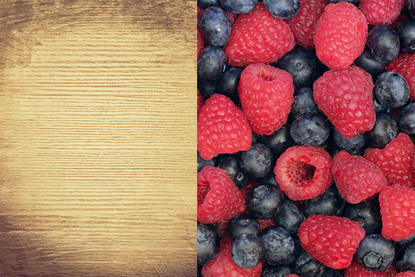
Finally, I wanted to add some texture to the background. I started with a high resolution wood background image from Flickr and placed this behind my red background. I then added a layer mask to the red background layer and shaded in grey so to appear opaque, revealing the texture of the wood below.

Backgrounds

Background images used

To make the footer appear more interesting, I added another layer between the red and wood backgrounds with an image of berries (from Flickr) and added a mask with a black/white gradient so the berries would appear to fade into the wood. To improve the blending of the wood and the berries, I applied a Desaturate style to the berry layer and adjusted the opacity of the mask on the red background where the berries show through.

By keeping the messaging, color scheme, typography and general design consistent, I believe my advertisement would fit in well with the current Epicurious integrated marketing campaign. In my opinion, it may even better illustrate the message that their website is meant to be an invaluable tool to all home cooks, not just another recipe website.

Grunewald_DesignShowcase5