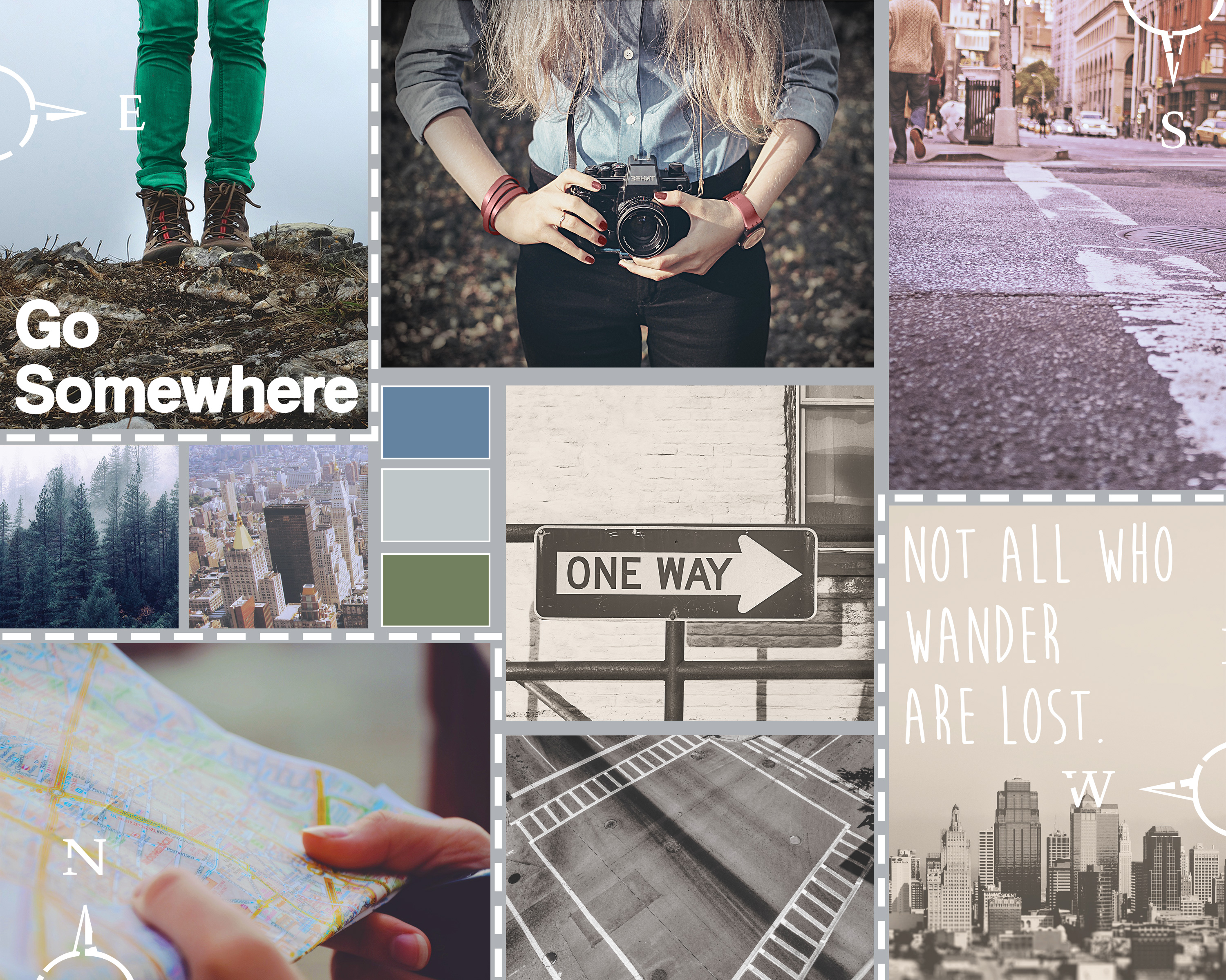
This week, I designed a moodboard for a brand/website I will be developing in another graduate class: StreetTreks.com. The idea behind Street Treks is to create a series of informative, fun and easy-to-use self-guided walking tours of a particular city so residents, especially those new to the area, can explore all of the unique neighborhoods and see everything their city has to offer. Besides promoting new experiences, my website will also promote an alternative activity to traditional hiking. While Seattle offers many mountainous trails, the city sidewalks can take you to views just as breathtaking.
Street Treks will be a website that combines both the rugged, earthy aesthetic of traditional hiking with the sleek and modern feel of the city. To convey this feeling, I designed my moodboard with a natural color palette, contrasting rustic with city images and mixing sleek and handwritten fonts.
Before I began my board, I searched for stock photography that fit my theme. I used Unsplash and pexels.com, as well as a few other resources that can be found here.
I loosely used this tutorial to help design the layout of my moodboard using the rectangle shape tool. I used my grid and guides to help with even spacing between boxes. Once I had a layout I liked, I placed my images and applied them as clipping masks to each rectangle so each box acted as a frame. Once all images were placed, I added image adjustments to various image layers as needed, including photo filters to help cool the tone of warmer images, and decreased brightness to correct washed-out images. Because my images are embedded as smart objects, I had to double-click each image to open it as a separate file, make edits and save.
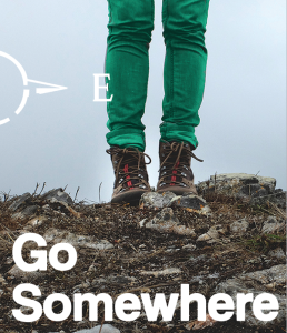
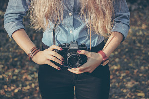
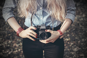
Per the project instructions, I needed to incorporate three Pantone colors of the year into my board. To add 2015’s Marsala, I selected the image of the woman holding a camera and used the color replacement brush at a high tolerance to change the color of her watch, fingernails, and bracelet. To add 2013’s Emerald, I selected the image of the woman wearing hiking boots and used the color replacement brush to change the color of her jeans from grey to green.
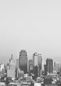
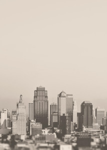
Finally, to incorporate 2006’s Sand Dollar, I took the image of a grayscale city skyline and added a layer of the color above the image using a “Multiply” blend mode, tinting the overall image.
The last image adjustment made was to the image of the woman holding the camera. I found a free downloadable Photoshop action called “Portrait Action” and applied it to my image. The action helps desaturate an image and comes in two parts. A couple steps must be manually done in-between Parts 1 and 2 as indicated in the instructions.
I added two sets of text, one in modern “Coolvetica” and the other in handmade “Moon Flower Bold,” both free from dafont.com. I purposefully tried to create a contrast by placing the more modern font on a rugged image, with the rougher handmade font on the modern city skyline. I also added a few dashed boxes and compass custom shapes to make the board more interesting and balance the white text. Finally, I added a color palette sampler that I felt reflected both the natural and city beauty of Seattle.
I like to think my final moodboard conveys to the viewer the StreetTreks.com goal: to take the scenic and woodsy activity of hiking and apply it to the city you’re already living in. A forested mountain hike isn’t always close by, but a city hike, exploring new neighborhoods and discovering new viewpoints, can be right outside your front door. So bring your camera, and your map (to be provided digitally by StreetTreks.com, of course) and start trekking!

