Designing an original moodboard for StreetTreks.com

Screen Shot 2015-02-18 at 2.16.04 PM

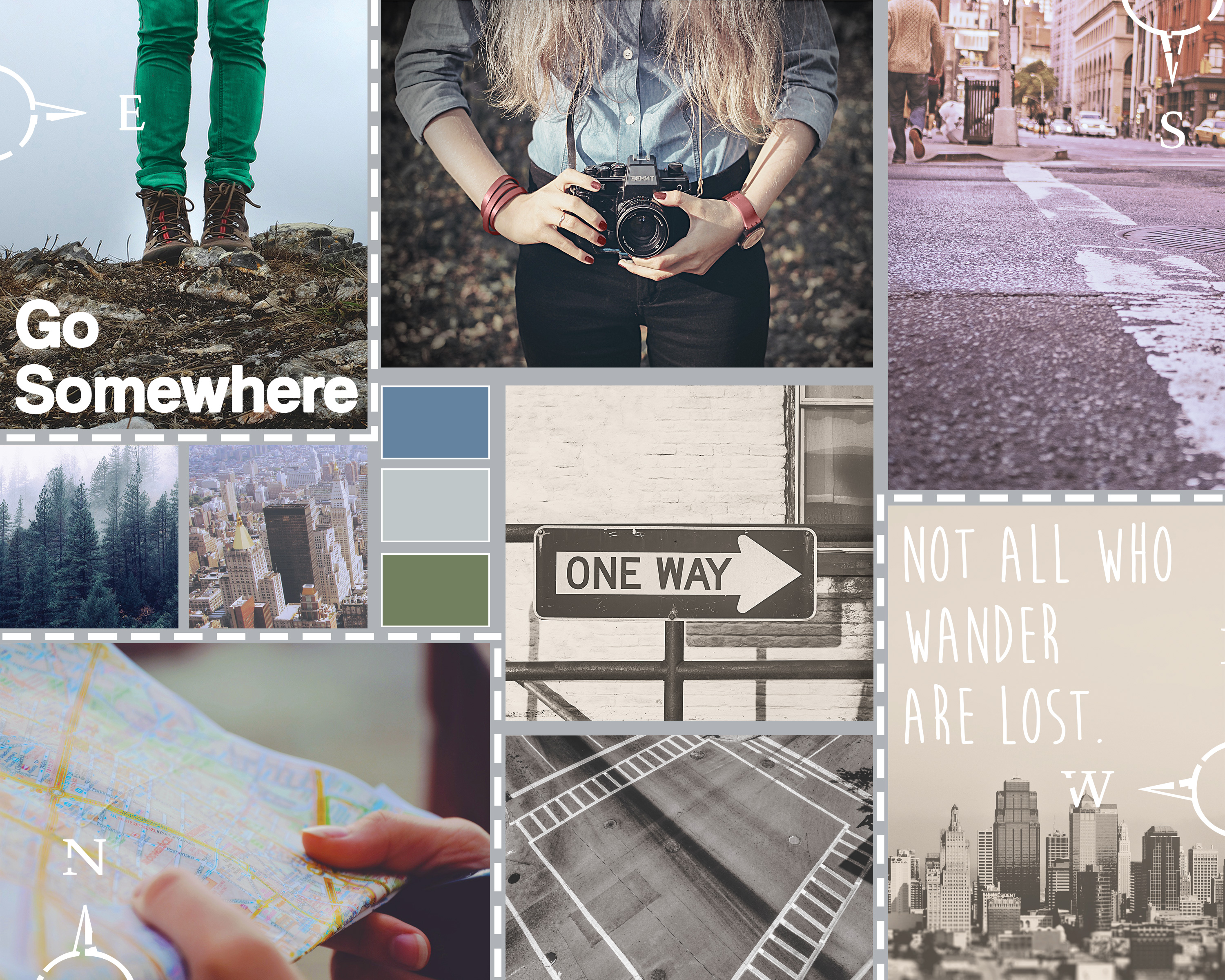
This week, I designed a moodboard for a brand/website I will be developing in another graduate class: StreetTreks.com. The idea behind Street Treks is to create a series of informative, fun and easy-to-use self-guided walking tours of a particular city so residents, especially those new to the area, can explore all of the unique neighborhoods and see everything their city has to offer. Besides promoting new experiences, my website will also promote an alternative activity to traditional hiking. While Seattle offers many mountainous trails, the city sidewalks can take you to views just as breathtaking.

Street Treks will be a website that combines both the rugged, earthy aesthetic of traditional hiking with the sleek and modern feel of the city. To convey this feeling, I designed my moodboard with a natural color palette, contrasting rustic with city images and mixing sleek and handwritten fonts.

Before I began my board, I searched for stock photography that fit my theme. I used Unsplash and pexels.com, as well as a few other resources that can be found here.

I loosely used this tutorial to help design the layout of my moodboard using the rectangle shape tool. I used my grid and guides to help with even spacing between boxes. Once I had a layout I liked, I placed my images and applied them as clipping masks to each rectangle so each box acted as a frame. Once all images were placed, I added image adjustments to various image layers as needed, including photo filters to help cool the tone of warmer images, and decreased brightness to correct washed-out images. Because my images are embedded as smart objects, I had to double-click each image to open it as a separate file, make edits and save.

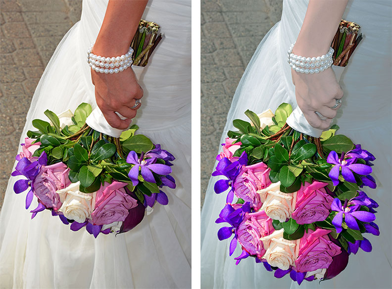
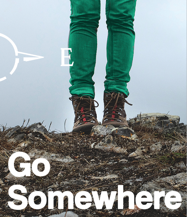
Per the project instructions, I needed to incorporate three Pantone colors of the year into my board. To add 2015’s Marsala, I selected the image of the woman holding a camera and used the color replacement brush at a high tolerance to change the color of her watch, fingernails, and bracelet. To add 2013’s Emerald, I selected the image of the woman wearing hiking boots and used the color replacement brush to change the color of her jeans from grey to green.

Pantone Colors of the Year

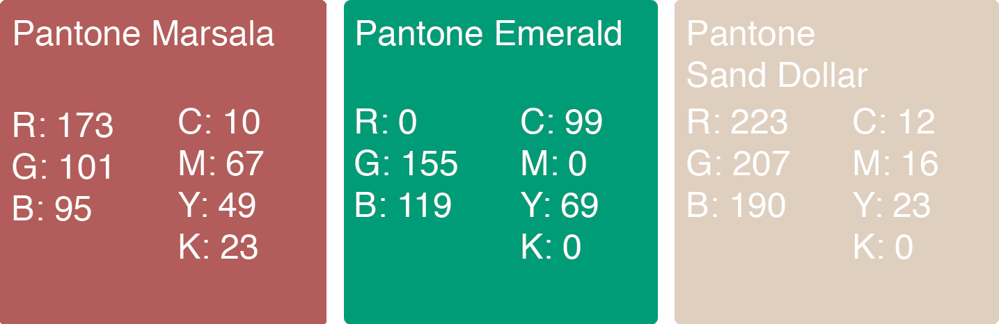
Finally, to incorporate 2006’s Sand Dollar, I took the image of a grayscale city skyline and added a layer of the color above the image using a “Multiply” blend mode, tinting the overall image.
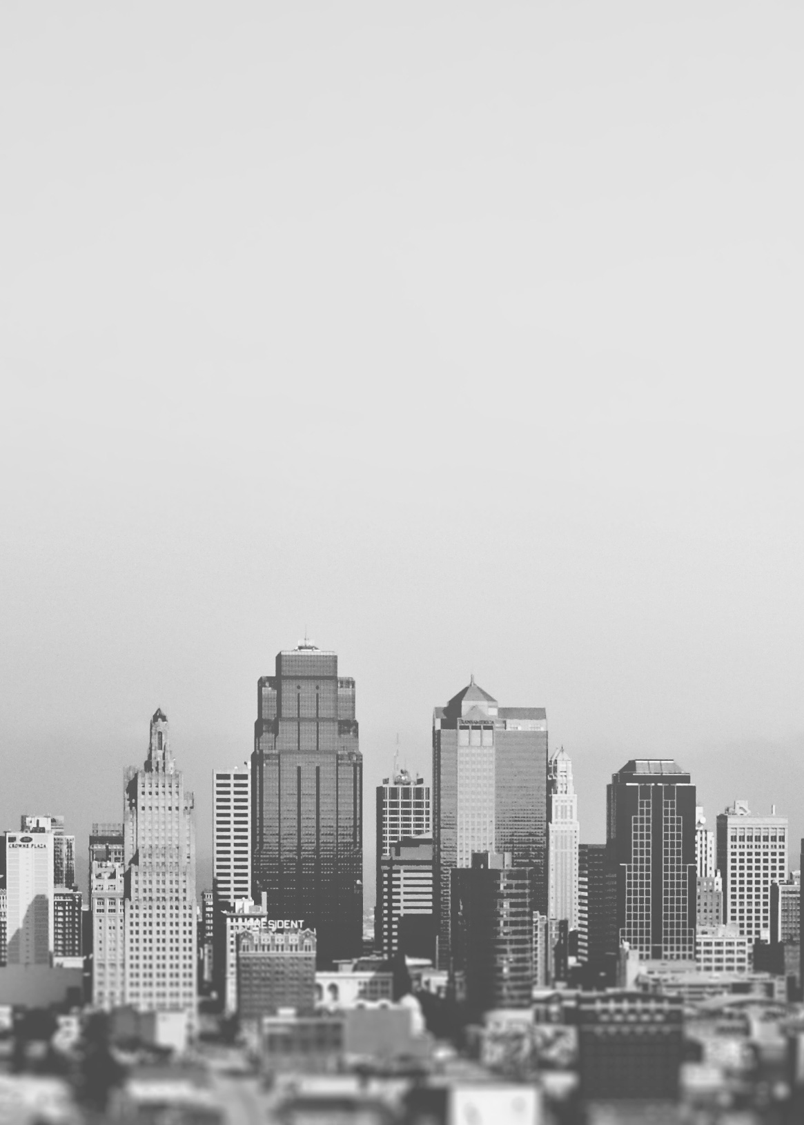
skylinebefore

Original image

Skylineafter

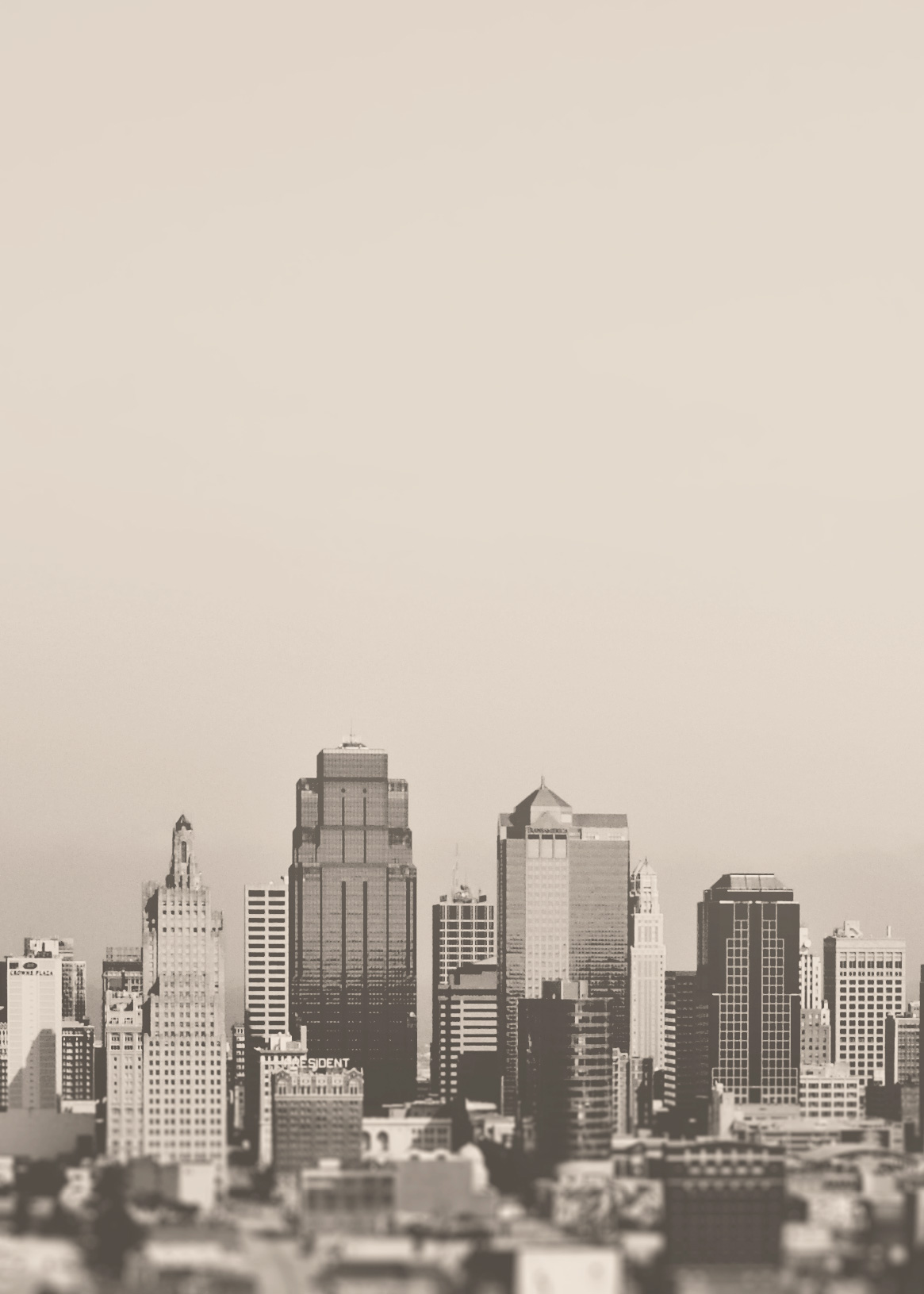
Sand Dollar layer applied

The last image adjustment made was to the image of the woman holding the camera. I found a free downloadable Photoshop action called “Portrait Action” and applied it to my image. The action helps desaturate an image and comes in two parts. A couple steps must be manually done in-between Parts 1 and 2 as indicated in the instructions.
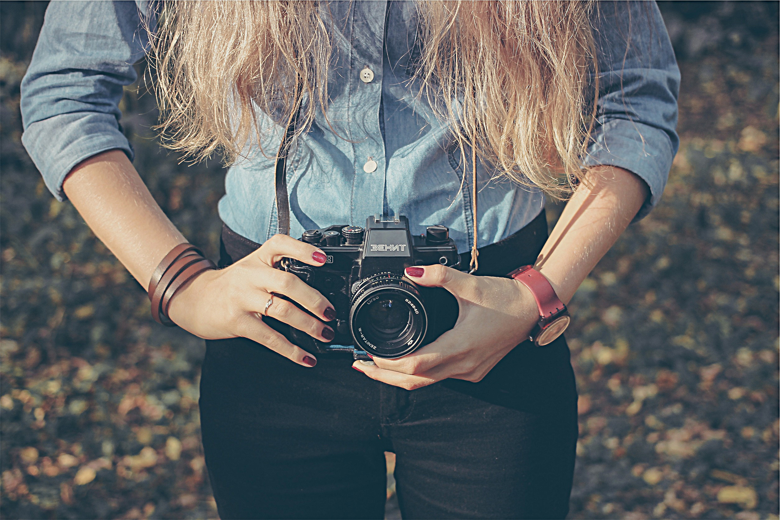
cameragirlmarsalabefore

Original Photo

cameragirlmarsalaafter

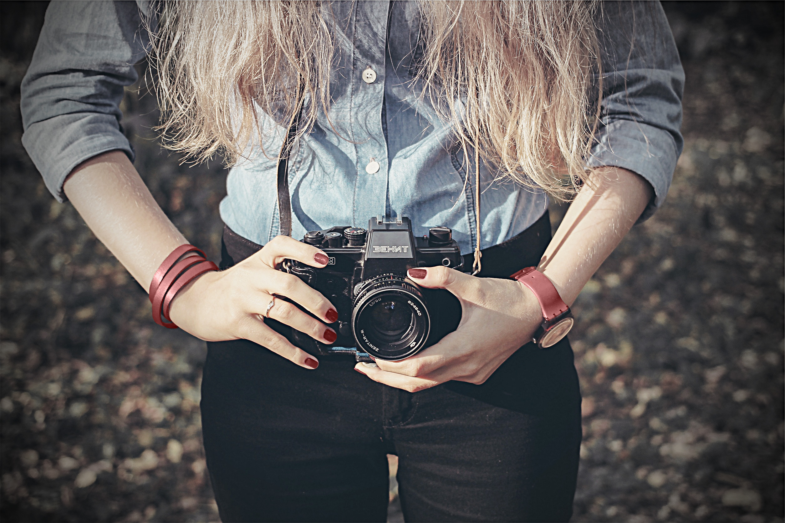
After Color Replacement and Portrait Action

I added two sets of text, one in modern “Coolvetica” and the other in handmade “Moon Flower Bold,” both free from dafont.com. I purposefully tried to create a contrast by placing the more modern font on a rugged image, with the rougher handmade font on the modern city skyline. I also added a few dashed boxes and compass custom shapes to make the board more interesting and balance the white text. Finally, I added a color palette sampler that I felt reflected both the natural and city beauty of Seattle.

I like to think my final moodboard conveys to the viewer the StreetTreks.com goal: to take the scenic and woodsy activity of hiking and apply it to the city you’re already living in. A forested mountain hike isn’t always close by, but a city hike, exploring new neighborhoods and discovering new viewpoints, can be right outside your front door. So bring your camera, and your map (to be provided digitally by StreetTreks.com, of course) and start trekking!

Grunewald_DesignShowcase7

Using Photoshop adjustment layers to manipulate color & tone

This week, we learned about various Photoshop tools as well as how to use adjustment layers and layer masks to edit parts or all of an image without making permanent changes to the original.

From the photos provided by my instructor, I chose an image of a woman’s arm and hand holding a wedding bouquet. I decided to think of this project as preparing an image for a high-end wedding magazine editorial piece, similar to those in the annual Vogue wedding issue. I searched online for photo inspiration and found that many of these glossy wedding photos have a cooler tone, with the models skin taking on a “porcelain doll” effect:

Inspirational Vogue wedding photos

In my original photo (see below), the woman’s skin appears very warm in color, and the bouquet, the focal point of the photo, is too dull to compete with the bright white of the wedding dress behind it.Before I tried to replicate the lighting and color tone of the inspirational photos I found, I watched this Photoshop tutorial on adjustment layers in order to refresh myself on how each of them work.

Original instructor-provided image

Original instructor-provided image

To begin editing my photo, I used the clone stamp tool and duplicated some of the flowers in a separate transparent layer above the original image in order to double the size of the bouquet. I cleaned up the edges of the cloned portion with the eraser tool, creating one cohesive bouquet. I then merged those two layers into one titled “Base Image”, however I kept an original version of the image and original clone layer, grouped in my layers panel, turned off, just in case.

I essentially split my image into three different layer masks using adjustment layers:

Mask #1: Bouquet Adjustments: 

  • Vibrance layer:  I masked off everything except the bouquet itself. I turned the vibrance up a little bit to get the flowers to “pop” without appearing too fake.
  • Selective Color layer: I created this layer as a clipping mask to the Vibrance layer/masked image below it. Adjusted the Greens in the image, turned down the Yellow in the image so the leaves appeared a deep green in color.
  • Brightness/Contrast layer: Bumped the brightness up just a few points to improve the overall vibrancy. Created as clipping mask to the layer below.
  • Hue/Saturation layer: Increased saturation +30 points to finish off the bouquet. Created as clipping mask to the layer below.
  • I used the dodge tool to lighten the shadows on the far left pink roses and the sharpen tool to bring out more of the details in the inner rose petals.

Mask #2: Outside Bouquet Adjustments: 

  • Vibrance layer: I used Cmd+I (on a Mac) to invert my layer mask so that I could make adjustments to everything outside of the bouquet without having to create a new mask from scratch. I turned the vibrancy all the way down to zero. This drained the colors so the bouquet’s vibrancy became starker in comparison.
  • Selective Color layer: In order to cool off the overall tone of the background and woman, I adjusted the Whites, Neutrals, and Blacks in this layer, experimenting a lot, but typically increasing Cyan and Black. With the Neutrals, I decreased black in order to allow some of the peachy skin tone to remain. This adjustment layer added just a hint of a blue tint to the photo. I created this layer as a clipping mask to the Vibrance layer/masked image below.
  • Curves layer: I used Curves for further tone adjustments, bowing the graph’s curve down just slightly to further deepen the blue tine of the shadows in the photo. This effect created an even starker difference between the bright bouquet and the rest of the photo. Created as a clipping mask to the layer below.
  • I used the sharpen tool to bring out more detail in the pearl bracelet.

Mask #3: Skin Adjustments:

  • Selective Color layer: On top of the changes made to everything outside of the bouquet, I created a layer mask for just the woman’s arm in order to further adjust her skin tone to complete the “porcelain doll ” effect — skin that appears cool to the touch and whiter in tone. I adjusted the Whites, turning the Black down to -100, decreasing Magenta a few points to remove more of the pinker skin hues, and bumping up the Cyan to cool the tone until it was the appearance I desired. I also toned the Neutrals very slightly, turning Black down about 15 points.

With all of these adjustment layers turned on, the resulting effect is one I believe makes a solid attempt to mimic the look and feel of a wedding magazine editorial photo, perhaps accompanying an article about wedding bouquet trends.

My final edited image

My final edited image

Here is a side-by-side comparison of the original photograph (left) and my edited version (right):

Side by side comparison of original photo and my edited version

As part of my assignment, I also added a Black/White adjustment layer on top of all of my layers, turning down the opacity to 50%. When this layer is turned on, the effect on the image is almost that of a vintage color photograph, with a slight antique coloration to the flowers in the bouquet.

Grunewald_Week3BlackWhite

Black/White adjustment layer engaged at 50% opacity

Previous to this project, I did not often use adjustment layers in my personal Photoshop projects, however now that I know how to use them, I believe implementing them (instead of the Image –> Adjustments menu options) promotes much more creativity and experimentation, without the fear of having to start over with the original image file. In my experience, it’s the vast number of opportunities for experimentation in Photoshop that makes image editing so much fun!