Disclaimer: This blog and its author are not affiliated with DSW in any way. Designs featuring their likeness are for educational use only.
Building upon the banner ads I created for DSW last week, this week I designed a branded email DSW could send to it’s female customers. The main promotion in the email is the spring sandal sale previously advertised in the banner ads. I decided to keep the promotion largely the same so as to follow best IMC practices. It’s commonly said in marketing that a customer needs to be “touched” by or exposed to a company’s message seven times before they engage with the brand. By keeping the messaging consistent between my banners and email campaign, DSW already has two of those touch points covered.
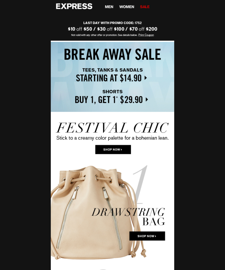
I got inspiration for my email campaign from an Express email I received with the subject line: “The 6 must-have festival accessories.” While I don’t often open promotional emails, I clicked on this one because of the term “must-have” and the reference to a specific number of items. Thanks to Buzzfeed, I’m automatically drawn to lists as quick ways to gather information, and by inferring that I “must have” these particular items. I’m sure I’m not the only one who felt compelled to open this email, which is why I would try to replicate it’s success for DSW with a subject line: “Your must-have sandals are here and on sale.” As a shoe lover, I know I would want to know what sandals I “must have.”
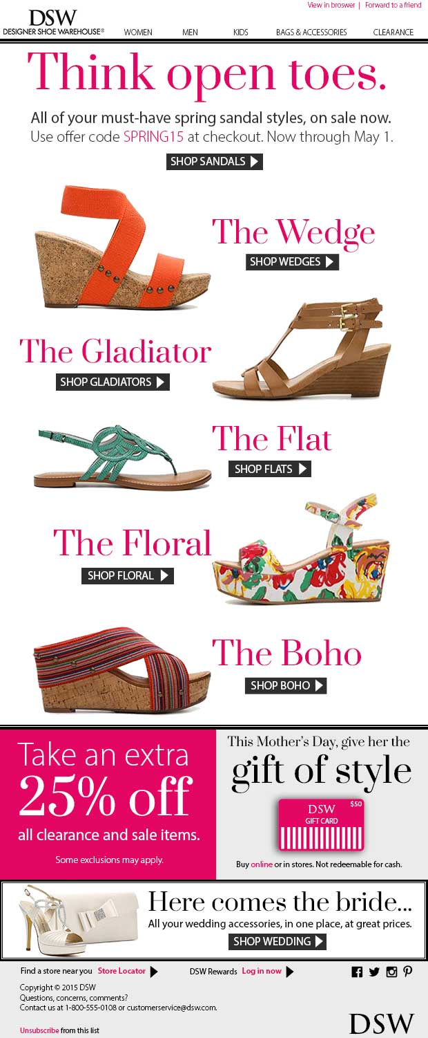
For my design, I opted for a 620 px width (500-650 px is standard). I started with the elements that should come first in a well-designed email: a header and navigation. For brand consistency, I mimicked the header layout of dsw.com and DSW promotional emails. I included links to view the email in a browser and to forward the email to a friend at the top of the page, since these are two actions DSW would encourage. As I explained in my previous post, DSW keeps a minimal design in order to keep the focus on their products. I continued the color palette I used in my banners: black and white, with a pop of pink. I used two fonts in my overall design: Prata (from Google Fonts) for a stylish editorial-like serif that is similar to the DSW logo font, and Myriad Pro for body text and readability.
Since my customers will click on my DSW email expecting to see the promised must-have sandals, I wanted to make this promotion front and center. I used the “Think open toes” copy from my banner ads and referenced the same sandal sale and offer code. I used the same button style for consistency.
I kept my shoe images (cleaned up with the magic wand tool) and accompanying text large so the reader could fully appreciate them on their computers and mobile devices. It was difficult to decide just how large to make my promotion because I wanted there to be enough content “above the fold.” I researched online for common email heights, however found discrepancies in the answer. I decided to make 600 px my “fold” and design enough content above it so readers would automatically want to scroll down. With my main sandal promotion starting at the very top of the email body, the reader will see at least part of it regardless of screen height.
To show a clear start and end to my main promotion, I used a double line similar to the border I designed for my banner ads. I also used this line style to frame a smaller promotion. For easier coding purposes, I designed my email in a series of boxes so that it could be easily sliced in Photoshop and imported into Dreamweaver.
I created three smaller promotions below my main. All are designed for women, my target audience. I continued the pink color I used earlier and the same fonts. To me, DSW is a retailer strictly focused on promoting it’s products, so I created smaller promotions featuring other products of interest. Since this email will be sent out in Q2, the spring season, I wanted to highlight Mother’s Day and wedding season, to encourage customers to think ahead and make these purchases now. In the gift cards promotion, I created my own version of a DSW gift card using shapes since online images were limited.
In my footer, I included a couple smaller features, including a link to the store locator and the option to sign in to your DSW rewards account. I also added basic social media icons in black to keep with the overall color palette. At the very bottom of the footer, underneath the copyright and contact information, I included the required link to unsubscribe from the DSW email list. It’s common to find this link, in small print, at the bottom of emails, since the brand doesn’t really want you to unsubscribe. I kept with this web standard so in case someone does want to unsubscribe, they will know exactly where to look.
Overall, I believe my email design fits in with the current DSW brand standards and is consistent with the look and feel of the banner ads I created last week. Together, my banner ads and email would be a great start to a DSW spring sandal marketing campaign – one of which I know I and other shoe lovers would definitely notice.


