Disclaimer: This blog and its author are not affiliated with Sitka & Spruce in any way. Designs featuring their likeness are for educational use only.
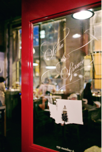
One of my favorite local Seattle restaurants is Sitka & Spruce, an intimate restaurant artfully serving seasonal Northwest cuisine, located in a small warehouse turned chic indoor marketplace.
Everything about this restaurant is fantastic…except it’s website. Sitka’s homepage is based on an unusual horizontal scroll that is not responsive. The mobile version homepage displays only one photo at a time without any restaurant information, leaving the user with just a hamburger menu icon. That’s why I chose to redesign their website, via a wireframe, in this week’s assignment.
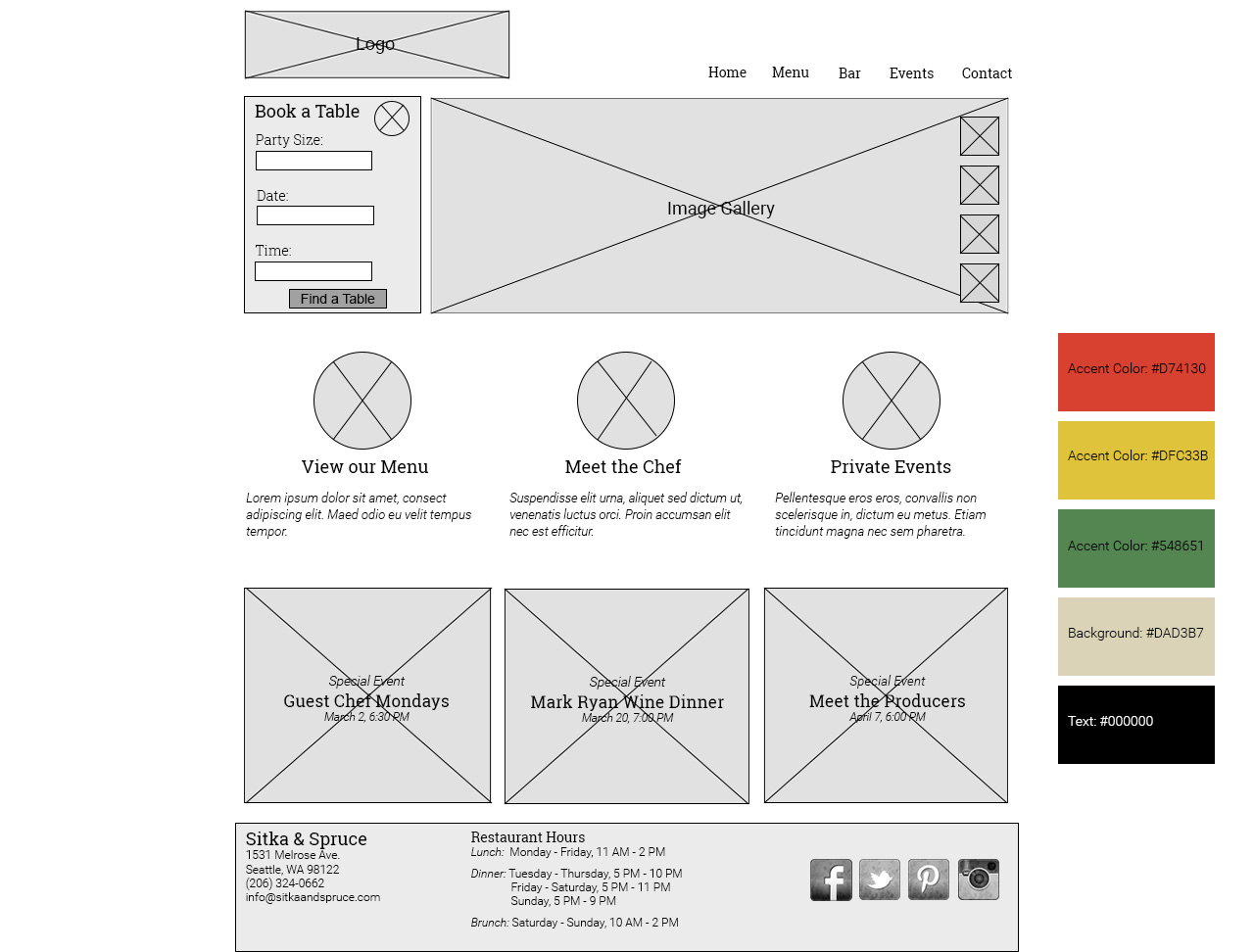
To model good responsive design, I organized my website in a single column with “fluid” content boxes that could easily resize and stack depending on the dimension of the user’s screen. I also created my website to be 800 px wide, considered, by some, to be an ideal size for a responsive website. I referred to Mediaqueri.es for inspiration.
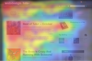
When a user purposefully seeks out a restaurant’s website, it’s typically to find a few basic pieces of information: menu, reservation information, hours and contact information. I chose to put these pieces of information in prevalent places on the website using an F-shape layout. Based on user behavior studies, it’s been proven that users first look at a website at the upper left corner and move right across the top line, proceeding to look increasingly towards the left column and downward the further down the page they read. This means, the most important information should fall in this F shape. You can see an example of this layout below – the warmer the color, the more users eyed that specific content.
To follow the F-layout, I placed the restaurant logo and navigation bar on the top line, so the user could quickly access the information they’re looking for. I then placed the an Open Table reservation widget directly below the logo, giving the user an immediate call to action (after all, the goal is to convert the user to a customer). I placed a rotating photo gallery of food and restaurant images next to reservations, so as to further entice the user to make that reservation.
Continuing with the F-layout, I put a linked Menu feature below the reservation box on the left, further enticing the user to visit the restaurant in person once they view the menu. Clicking on this would lead to a separate page containing the full menu. I added additional features the user might find interesting or useful, including an introduction to the chef and information on how to book a private event. I paired these links with illustrations (not photos) to match those on the restaurant’s current website, forming a consistent theme.
I added Special Events in boxes below, creating a basic grid. Each special event header would be placed over a faded or blurred image, adding more color and interest to the page. This information would be considered less important than some of the previous, which is why I placed it further down the page. The “Events” tab in the navigation bar would also reveal this same information.
Finally, to complete the F-layout, I added a footer with Sitka’s address, phone and email, as well as their restaurant hours. I also added social media links, as most users, I think, are accustom to looking in the footer for this information. I found faded/distressed social media icons here (along with a ton of other social media icon freebies).
Looking forward to the overall aesthetic design of the website, I wanted to keep the current color palette, inspired by colorful, detailed nature illustrations, including flowers and animals, used on their current website. The larger illustrations (see below) include reds, golds and greens. By keeping the same antique beige background and black text as on the current website, my redesign would provide brand consistency and not confuse users accustom to the current site. My website, however, would be easier to navigate and more functional on a variety of screen sizes. The goal of my redesign is to essentially have the design itself become invisible, shining the real spotlight on the beautiful restaurant, its cuisine and the information about them that users want and need.


One thought on “A Restaurant Website Redesign using Wireframes and Responsive Design”