Complete Brand Identity Design: Catered by Patti Caces

COMPANY ANALYSIS:

Catered by Patti Caces is an established professional catering company in Central Florida that has thrived on its solid reputation. Although there is not a significant digital presence, the company maintains a successful business with both wedding and corporate clients. Their mission is simple: to take care of their clients. They do so by serving high-quality (and delicious) cuisine while providing high-quality service. Based on their reviews, I’m not surprised they’ve been successful with little digital marketing — word travels fast when you have happy clients. Establishing the brand online, however, will certainly help the company reach and engage a much larger audience of potential clients.

The company’s current goal is to further expand their list of corporate clients in the film industry by providing on-set catering and craft services during local productions. With this in mind, the target audience of their new brand identity campaign should be these corporate clients, while still being inclusive of their wedding clients. In order to reach this diverse group of clients, I recommend the company follow best integrated marketing communication (IMC) practices. IMC is the development and execution of a cohesive multi-channel identity campaign that immerses the target consumer in a consistent experience every time they encounter the brand. We want every consumer who encounters the name “Patti Caces” to immediately associate the name with professional catering, quality customer service and delicious products.

Currently, the company appears to go by a few different names online, including 1st Choice Production Catering, Catered by Patti Caces, and simply, Patti Caces. Fragmentation in the company name might create confusion among consumers. According to a Bloomberg Business article, fragmentation is the number one enemy of successful brand marketing. The solution? IMC. Catered by Patti Caces needs to promote a cohesive identity across all of their marketing channels, including consistent use of company name, messaging, visuals and voice, in order to build a solid, recognizable brand.

MY STRATEGY:

To relaunch the Patti Caces brand with a wide online presence, I’ve designed an IMC campaign that will help establish a modern visualization of the brand. I designed the company’s brand identity with the name “Catered by Patti Caces” in order to take advantage of the company’s existing name recognition while keeping their services obvious to new potential clients. The overall feel of the brand design is bright and crisp, appearing well-established yet energetic and fresh. I kept the designs flexible, focusing more on the company’s dedication to product and service than the types of clients they serve. The campaign successfully draws attention to the Catered by Patti Caces name while highlighting their on-set catering business, a service that might not be immediately known to their other established clients and so needs further promotion.

DESIGNS:

Logo:

The logo should encapsulate the brand’s essence while still being simple and flexible enough to appear in a variety of print and digital forms.  I designed the logo in two parts: a symbol and a text portion. The logo could be used as a whole or split depending on need, and can also be arranged vertically (as it appears here) or horizontally. The color palette is bright, fresh and appropriate. The symbol is telling, yet simple. Each circle represents a tier of the Catered by Patti Caces business: professional service, baking and cakes, and quality cuisine. The circles link, representing the business being built on all three of these values. The text portion of the logo features a modern font pairing that places emphasis on the Patti Caces name. I created the tagline, “Motivated by quality, inspired by you, since 1988,” to again highlight the values while emphasizing the well-established nature of the business. To remain flexible, the tagline need only accompany the logo when appropriate. The logo provided is currently set to a digital-appropriate resolution (72 dpi), however a higher resolution image appropriate for print could be easily provided at the company’s request. 

Full color logo for Catered by Patti Caces

Full color logo for Catered by Patti Caces

Grayscale logo

Grayscale logo

Reverse/dark background logo

Reverse/dark background logo

Banner Ads:

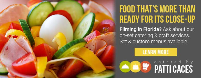
The banner ads I created utilize the logo and continue its color palette and typography in order to remain visually consistent. These banners are for use on the Catered by Patti Caces website and could also be used to advertise on other appropriate websites. The specific promotion focuses on both the quality nature of the company’s products while highlighting the on-set catering service. The ads are simple, featuring large, enticing images and bold type. The call to action here is to learn more about the film catering arm of the business that many clients or potential clients might not think of when they think of “Patti Caces.” 

Leaderboard banner

Leaderboard banner

Enhanced leaderboard banner

Enhanced leaderboard banner

Cube banner

Cube banner

Button banner

Button banner

Animated cube banner (if not playing, please click to reopen in new tab)

Animated cube banner (if not playing, please click to reopen in new tab)

Social Media:

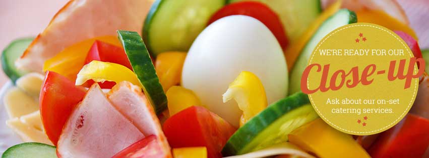
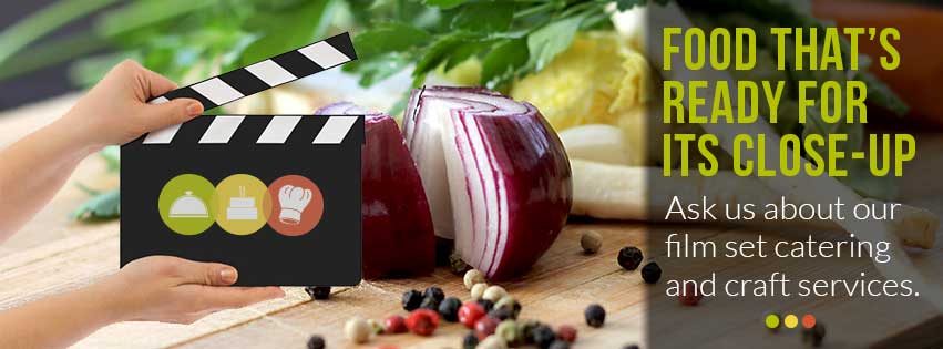
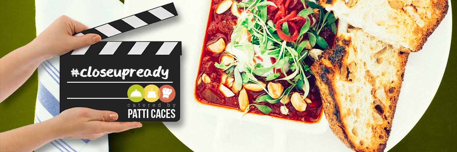
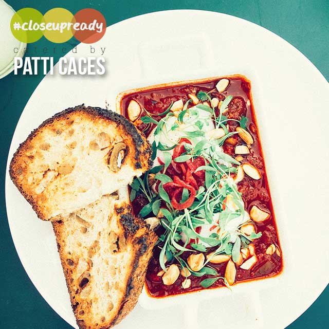
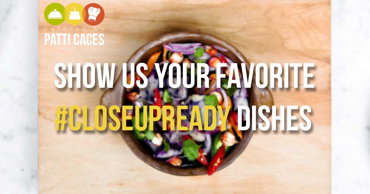
I created a social media branch of this campaign as these platforms are known for potential high levels of engagement with brands. I’ve provided several cover page options for Facebook, as well as an option for Twitter. I also designed a transparent overlay that could be used on images posted to Instagram or Pinterest. To promote engagement with the brand, I created a hashtag (“#closeupready”) users could add to their own posts and share back with the Patti Caces social media pages. Despite differences in design, the overall look and feel of each is consistent with the brand identity I created.

Facebook cover image (Option 1)

Facebook cover image (Option 1)

Facebook cover image (Option 2)

Facebook cover image (Option 2)

Facebook cover image (Option 3)

Facebook cover image (Option 3)

Twitter cover image

Twitter cover image

Overlay graphic for use on Instagram or Pinterest

Overlay graphic for use on Instagram or Pinterest

Potential graphic to share on Facebook

Potential graphic to share on Facebook

Email:

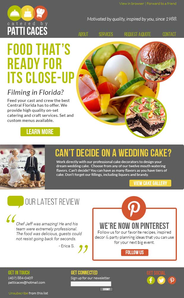
I designed an email to accompany this campaign that could be sent out to the company mailing list. Again, the promotion draws attention with gorgeous food photos, while inviting recipients to learn more about the film catering services. To be inclusive of other types of clients, I’ve included a smaller promotion related to weddings, a recent client testimonial, and a call for clients to follow the company on Pinterest, an important IMC channel for businesses such as this one (more on that to come).  As you can see, the email continues with the color palette and bold typography inspired by the logo for visual consistency.

Sample email featuring my campaign

Sample email featuring my campaign

Website:

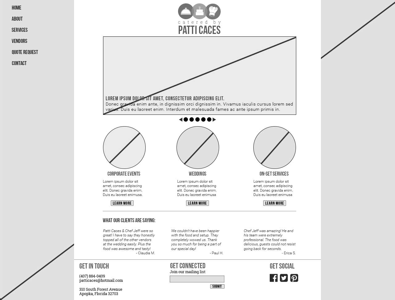
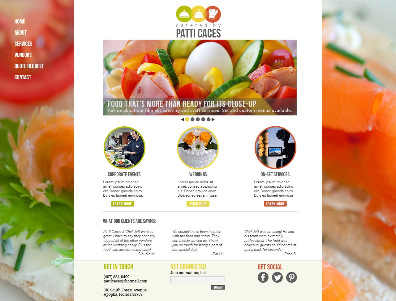
Now that I’ve created these various “touch points” where consumers can encounter and engage with the Catered by Patti Caces brand, there needs to be a central point where these consumers can ultimately learn all they need to know about the business. Today, that point is overwhelmingly a functional and updated website. The website homepage is designed very much like other pieces of the campaign with large photos that can draw in potential clients.  Although bright and colorful, with color palette and typography consistent, the content is provided in a simple, easy-to-use fashion. A rotating image gallery would include current promotions (such as the one I’ve designed for the on-set catering business) while the body of the site would direct potential clients to various pages featuring services the company provides. Client testimonials on the homepage can also help attract potential clients by giving them just enough to convince them to reach out to the company for more information. The footer of the website would also provide potential clients with various ways to engage with the company, including basic contact information, signing up for the mailing list, or following on social media.

Website wireframe design

Website wireframe design

Full color webpage design based on wireframe

Full color webpage design based on wireframe

SUMMARY:

Aside from the various marketing channels I’ve designed for above, there are several other opportunities for further visual IMC out there. An e-newsletter that includes recipes, information about new products or services, photos and reviews could help remind potential clients of the company’s services so that they think of Catered by Patti Caces first when they have a special event. As mentioned before, Pinterest is a great place for visually interesting companies such as this one to subtly promote their business through the posting of photos, recipes, decor or event planning ideas. This could be a great opportunity for the company to not only show off their expertise, but to attract new clients.

In summary, it was a great pleasure to design a brand identity for Catered by Patti Caces. After reading through their entire website and seeking out reviews of the business, I knew a dedicated, client-focused business such as this one needed to have a greater brand presence not just for the good of the company, but for the good of those potential clients out there. With this in mind, I tried to design a visual identity and brand campaign that would appeal to a wide audience and portray the company as one that is experienced, welcoming and attractive to work with. Through this creative process, I learned a lot about designing for a real client and look forward to similarly challenging work in the future.

Experimenting with lighting and typography to create an e-card

I can’t believe it’s my last week as a formal student of Photoshop. Of course, there’s much, much more to learn, however I feel that I greatly improved my skills over the past semester, especially in training my designer’s eye to recognize the best practices for marketing and digital design. To finish off the semester, this week I created a digital e-card that the University of Florida Alumni Association would send out to their upcoming Spring 2015 graduates.

Following best e-mail practices, I kept my design width between 500-650px at 600px. I kept the design square so to be a more flexible design. I found a University of Florida graduation photo and decided to duplicate the image so that the background of the image would be in grayscale while the student in the foreground would remain in color. I cut out the student using the quick selection tool, cleaning up edges with the eraser.

Almost at the same time, I worked on the right portion of the image that would contain my text. I decided to create a curved line between the image and the text portion using a blue ellipse so as to appear more visually interesting. I found a free alligator skin texture online and applied it to the blue ellipse with a clipping mask in the Overlay blending mode, opacity level about 70%. This gave the ellipse a subtle texture that wasn’t too busy to overlay with text.

Back to my photo, I applied lighting effects to the student using three spot lights: one streaming light from the upper left corner towards the bottom right (down the student’s left arm), one streaming from the upper right corner towards the bottom left (down the student’s right arm), and one streaming down directly onto his head. I upped the intensity and dulled the absence slightly so the student appeared to glow from the front. This reminded me of that feeling you get when you graduate, the feeling that you’ve finally reached the light at the end of the tunnel. It feels so good. Since my image is rasterized (not embedded), the lighting effects do not appear as fx smart layers on the student cut-out layer. Instead, to better understand the lighting effects I used, one would have to compare the original photo (included in my submitted Photoshop files) with the cut-out layer.

I added the UF Alumni Association logo to the top right corner of the e-card with some cleaning up by the magic wand tool.

Finally, I added my text. I used free font, Bree Serif to write my main header of “Congrats!” and added various layer effects including a slight bevel and contour, a soft white stroke, and a subtle drop shadow (in gray), to give the text more depth. I then kerned the font (+75) between the ‘R’ and ‘A’ since the letters appeared to be touching. With my header evenly spaced, I added my subhead and additional copy in Droid Sans, to provide typographical contrast.

As a call to action, I included a button asking recent graduates to update their profiles with the alumni association so the association can keep track of them and keep them up-to-date on the goings on at UF. Social media icons courtesy of Font Awesome complete the card. 

Grunewald_DesignShowcase15

Overall, I am pleased with the way this card turned out. I consider typography to be a personal weakness, so this was a particular challenge for me. The lighting was also difficult at times, with my Photoshop program crashing a couple times before I finally got it right. I learned so much this semester and can’t wait to learn even more as I continue towards my goal of achieving a master’s in web design and online communication.

Creating infographics in Photoshop, with a little help from the pen tool

Disclaimer: This blog and its author are not affiliated with ThinkProgress in any way. Designs featuring their likeness are for educational use only.


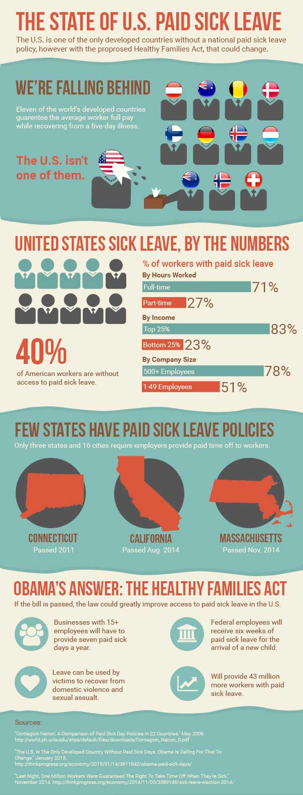
I think this week’s assignment was the most challenging yet. This week, I created an infographic based on an article by ThinkProgress, “The U.S. Is The Only Developed Country Without Paid Sick Days. Obama Is Calling For That To Change.” The article discusses the proposed Healthy Families Act as well as the current state of paid sick leave access in the U.S. In summary, the U.S. does not have a good reputation for paid sick leave, with many working Americans having no paid sick leave at all. The Healthy Families Act would try to improve on this issue.

Before I opened Photoshop, I first read through the article, as well as several other affiliated articles that were linked to in the original, including a brief research study on paid sick leave in the U.S. There were a lot of statistics referenced throughout these articles, and it was difficult to choose which points would work well for my infographic. I decided to focus on the current state of paid sick leave in the U.S. and after printing out the articles I wanted, highlighted the core facts I wanted to include. I wanted my infographic to give a well-rounded overview on paid sick leave in the U.S. so I focused on a few facts I thought would best fit this purpose.

I then sought out inspiration on Pinterest, looking for infographics and graphic elements I liked. Afterwards, I drew a very rough wireframe of my design so I could stay focused when designing in Photoshop. To determine the dimensions of my infographic, I actually found an infographic about that very topic. While there are no real set dimensions for infographics, I chose the common width of 600 px. I then started with a height of 1000 px but extended my canvas as needed.

The infographics I liked had a clear organization, with different sets of data or topics separated by boxes or borders. I decided to separate my design into six parts: the header, a section comparing the U.S. to other countries, a section on U.S. statistics, a section on existing state laws, a section describing the proposed new law, and finally a section for my sources. I used two different background fills to distinguish these different sections.

I wanted to display my data in a variety of ways in order to keep the infographic visually interesting, but also to illustrate each set of data in an appropriate way I used human figures and flags to display different countries. I used bar charts to illustrate comparative percentage stats. I also used simple images and icons to highlight short snippets of information about state laws and the new proposed Healthy Families Act. Each section is distinctively different in data display, however the consistent typography and color palette helps to provide consistency throughout. I also ordered my sections in a way I thought made sense and told the story of paid sick leave in the U.S., starting with the big international picture and moving into more and more details, first at the national level and then the state.

I used the pen tool to add character to my infographic through the use of custom shapes. In Illustrator, I created my simple worker figures used in my second section so I could use the Pathfinder panel to merge the shapes. Once I moved those figures into Photoshop, I added some fun extras with the pen tool, including the wet sneeze from Ms. United States, and the tissue box Mr. New Zealand so helpfully provides. I also used the pen tool to create my blue background boxes with the uneven borders. I believe these boxes, instead of basic rectangles, adds depth and another element of interest to the overall graphic.

Grunewald_DesignShowcase14

Editing video and adding graphics and animation in Photoshop

Disclaimer: This blog and its author are not affiliated with Ojai Olive Oil Company in any way. Designs featuring their likeness are for educational use only.


This week, I edited video for the first time and I did so in Photoshop. Before this week, I didn’t even know you could edit video in Photoshop, so I was impressed with the number of features and fair ease of use. I followed this lynda.com tutorial to edit the provided video. The video features the founder of Ojai Olive Oil Company discussing the history of his farm’s olive grove and the olive oil production process. There is a lot of beautiful scenery throughout however the speaking portion of the piece is pretty dry and the accompanying soundtrack is a little hokey. The video and audio are provided on a single track, so unfortunately, the music had to stay.

I first edited the video to shorten its length. The original video is about two minutes long. According to an article posted on The Next Web, testimonial or “talking head” videos should be between 60 and 119 seconds in length for marketing purposes so that it will appeal to a wider audience online than just those who really want to learn more about the company. I edited out some superfluous frames from the start so that my opening screen – the first thing consumers see when they come across the video – is intriguing with the image of a sign pointing the way to learn more about Ojai Olive Oil.  I also cut out the entire second portion of the video that discussed the olive oil production process since the video cuts off in the middle of the description. After editing my video, it’s now 68 seconds.

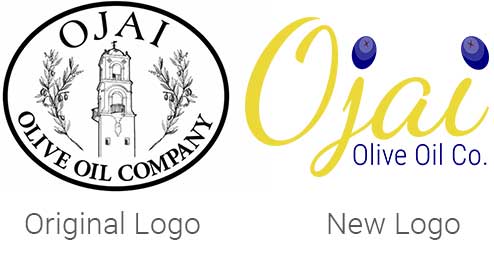
I created a new logo for the company to include in the video since their current logo is outdated and not very flexible since it includes very detailed imagery. I updated the logo with new typography (Dancing Script and Roboto Condensed from Google Fonts) and included the brighter colors from their website color palette – deep blue and gold – for a more contemporary design. I created a couple olives in Illustrator and brought them into Photoshop to dot the i’s in “Ojai.” For my title screen, I faded the logo in on a semi-transparent background and then changed the logo style and opacity to move it into the bottom right corner of the screen for the majority of the video – this is called an ID bug. I also faded in a brief line of text to describe the contents of the video – “About Our Ojai Farm.”

logos

For the founder’s interview, I included a feathered, semi-transparent lower-third in gold with the gentleman’s name and title to give him credibility. I moved and faded out the lower third once he was off-screen so the viewer could take in all of the gorgeous scenery featured at this point in the video.

To end the video, I faded out the founder as he wraps up a discussion on the colors of ripening olives. As a cute transition between the interview and the closing slide, I created a separate, taller layer scattered with the olives I created for the logo and triggered an animation to show them falling down the screen. This then fades into the now full-color logo and company contact information.

Overall, after I understood how the animation tools worked, I enjoyed using Photoshop for basic video editing and animation. I also see how video editing can become extremely time consuming, editing out frames and adjusting fades and effects by the tenth of a second. The animation I played with is fairly smooth, but I believe for motions more complex than simple direct movements or rotations across the screen, Photoshop probably isn’t the best program.

Designing for Brands on Social Media

Disclaimer: This blog and its author are not affiliated with discoverlosangeles.com or the Los Angeles Tourism & Convention Board in any way. Designs featuring their likeness are for educational use only. 


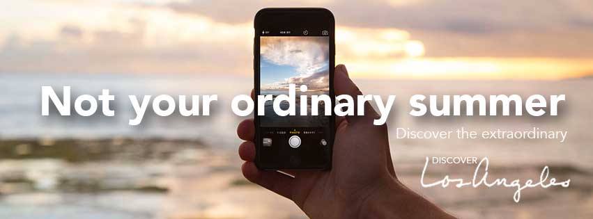
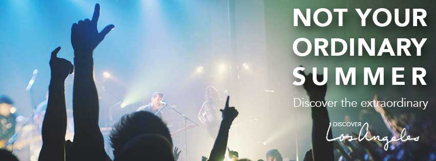
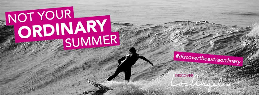
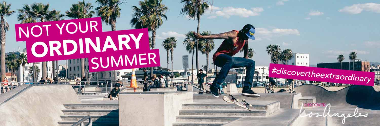
Social media continues to be a growing marketing platform for brands seeking to engage with the most consumers possible and to promote themselves to targeted groups of users. Despite the rising number of social media platforms, Facebook, Twitter and Instagram are considered three required social networks in which brands should actively participate. This week, I created a potential Summer 2015 brand awareness campaign for the Los Angeles Tourism & Convention Board and their LA tourism website, discoverlosangeles.com. I wanted to create a social media campaign targeted at young professionals and millennials, encouraging them to seek out a more exciting summer vacation and visit Los Angeles this summer. The title of the campaign is “Not your ordinary summer. Discover the extraordinary.”

My Facebook cover photos are set to 851 x 315 px. In my first design, I kept the text simple, horizontal across the middle of the image while on my second design I chose to stack the text on the right side in all caps. I added a drop shadow to the text for both to help it pop. Either design allows ample space for the Facebook profile picture. I also included the Discover Los Angeles logo on two of my Facebook designs, however on my third Facebook design, I included a hashtag, #discovertheextraordinary, instead as another way to promote engagement with the brand on social media. When the logo is not included in the cover image, it could appear in the profile picture. My third design is also drastically different from the prior two, using a grayscale photo with white text in pink text boxes. This pink color is a part of the discoverlosangeles.com color palette, adding another element of the brand to the campaign. Black and white color palettes featuring pops of color are a popular design for brands marketing to my same target audience. I created layer comps of my different Facebook designs and exported them as a PDF so they could easily be shared and seen in one document with the client, even if they don’t have Photoshop.

Grunewald_DesignShowcase12_FB1

Grunewald_DesignShowcase12_FB2

Grunewald_DesignShowcase12_FB3

To build on my Facebook campaign, I would design a profile picture to complement the accompanying cover photo, tying in the respective color palette and typography. I would also create related Facebook timeline posts featuring information on upcoming exciting summer events in LA, as well as design additional sunny, enticing photos and graphics with the hashtag #discovertheextraordinary. To increase user engagement, we could create a more interactive aspect of the campaign with posts asking “How will you make your summer extraordinary?” that could even include a contest to win a trip to Los Angeles this summer, sponsored by the LA Tourism & Convention Board.

My Twitter cover photo is set to 1500 x 600 px. According to a 2015 Pew Research Center report on social media use, the majority of Twitter users are between 18 and 29 years old, so I decided to feature a cover image that would appeal more to this age group. I also opted to carry over the typography design and pink color from my third Facebook cover photo, including the hashtag to encourage user engagement. The result is an image that overall has a young and summery feel that would surely appeal to my target audience.

Grunewald_DesignShowcase12_Twitter

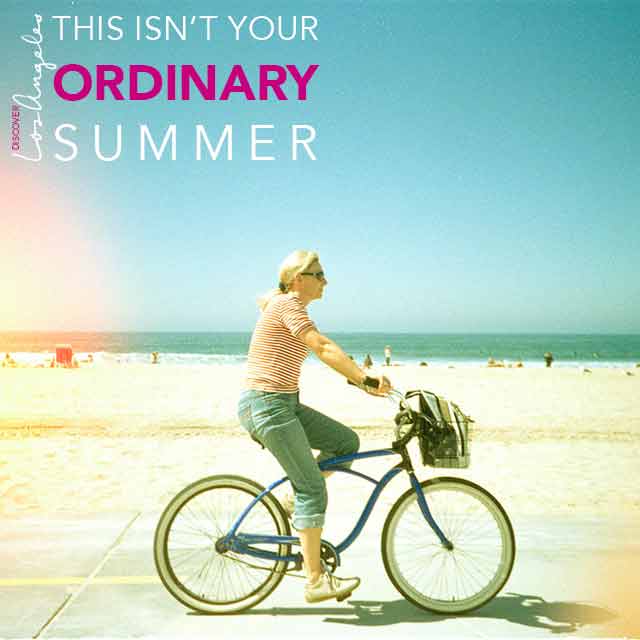
Finally, I created a simple banner that could be used on the discoverlosangeles.com Instagram page on a variety of photos. The banner features the logo (rotated vertically) and the statement “this isn’t your ordinary summer,” again reinforcing the campaign that Los Angeles is a more exciting place to be than any other this summer. I kept the banner text-based with a transparent background so it could be easily overlaid onto any Instagram photo, without taking away from the photograph itself. The text is in white with the pop of pink, adding just enough emphasis while remaining aesthetically pleasing.

Grunewald_Instagram

Across my designs, I included enticing photographs of Los Angeles that would appeal to my target audience, including references to technology, music, and activities such as surfing and skateboarding. I used a contemporary sans serif font, Avenir, in various forms, across all of my designs and overlaid the text in white for a modern and trendy feel. To create a sense of integration across all of my social channels and follow the best practices of IMC, I used this same typography style and photographs with the same general look and feel. I used the same pop of pink in one of my Facebook banners, in my Twitter banner and in my Instagram design. If my client were to choose one of the Facebook banners without the pink, I would work with them to see if they would want to include the pink in that banner or to remove it from the Twitter and Instagram designs completely since I believe these designs would also work well in all white.

If I were to expand my social media campaign for the LA Tourism & Convention Board and discoverlosangeles.com, I would recommend including Pinterest and Snapchat. According to an article posted by TechCrunch, Snapchat is the third largest social network among users 18 – 34 years old (my target audience), behind Facebook and Instagram. Twitter comes in fourth, and Pinterest is fifth. Both Snapchat and Pinterest are built on the concept of sharing photos and re-sharing photos, which would fit in well with my current campaign. On Snapchat, my campaign can feature photos of the cool and interesting sites in Los Angeles, such as the iconic street art and unique individuals that represent the hipness of the city, along with our campaign hashtag and variations of our campaign copy. On Pinterest, we could create a board specifically for our campaign featuring photos and graphics that relate to the theme of “how to have an extraordinary summer” in Los Angeles. If my client chose to incorporate the pink color in their Facebook, Twitter and Instagram campaigns, I would want to incorporate this color in all of our graphics in some way (either in text or using the color replacement tool in photos or graphics) as a signature of the campaign.

Designing an email for shoe lovers in Photoshop

Disclaimer: This blog and its author are not affiliated with DSW in any way. Designs featuring their likeness are for educational use only. 


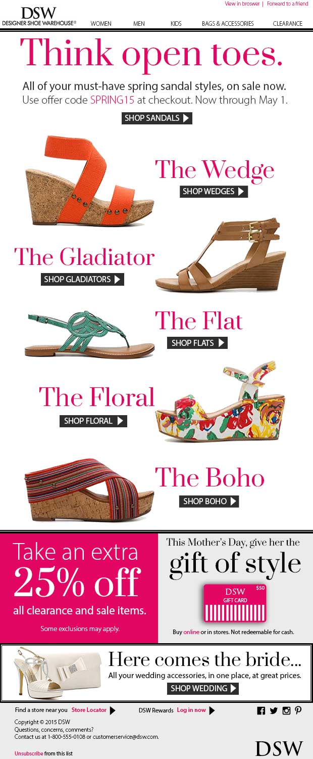
Building upon the banner ads I created for DSW last week, this week I designed a branded email DSW could send to it’s female customers. The main promotion in the email is the spring sandal sale previously advertised in the banner ads. I decided to keep the promotion largely the same so as to follow best IMC practices. It’s commonly said in marketing that a customer needs to be “touched” by or exposed to a company’s message seven times before they engage with the brand. By keeping the messaging consistent between my banners and email campaign, DSW already has two of those touch points covered.

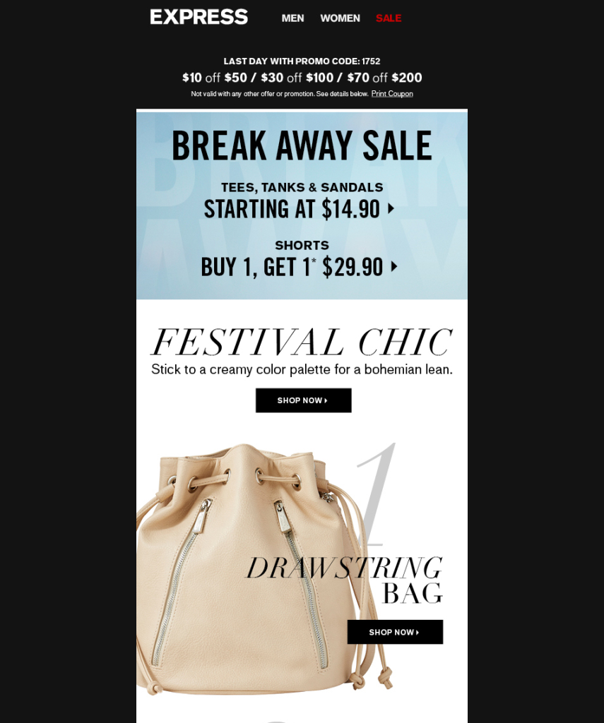
I got inspiration for my email campaign from an Express email I received with the subject line: “The 6 must-have festival accessories.” While I don’t often open promotional emails, I clicked on this one because of the term “must-have” and the reference to a specific number of items. Thanks to Buzzfeed, I’m automatically drawn to lists as quick ways to gather information, and by inferring that I “must have” these particular items. I’m sure I’m not the only one who felt compelled to open this email, which is why I would try to replicate it’s success for DSW with a subject line: “Your must-have sandals are here and on sale.” As a shoe lover, I know I would want to know what sandals I “must have.”

Promo email from Express - my inspiration

Promo email from Express – my inspiration

For my design, I opted for a 620 px width (500-650 px is standard). I started with the elements that should come first in a well-designed email: a header and navigation. For brand consistency, I mimicked the header layout of dsw.com and DSW promotional emails. I included links to view the email in a browser and to forward the email to a friend at the top of the page, since these are two actions DSW would encourage. As I explained in my previous post, DSW keeps a minimal design in order to keep the focus on their products. I continued the color palette I used in my banners: black and white, with a pop of pink. I used two fonts in my overall design: Prata (from Google Fonts) for a stylish editorial-like serif that is similar to the DSW logo font, and Myriad Pro for body text and readability.

Since my customers will click on my DSW email expecting to see the promised must-have sandals, I wanted to make this promotion front and center. I used the “Think open toes” copy from my banner ads and referenced the same sandal sale and offer code. I used the same button style for consistency.

I kept my shoe images (cleaned up with the magic wand tool) and accompanying text large so the reader could fully appreciate them on their computers and mobile devices. It was difficult to decide just how large to make my promotion because I wanted there to be enough content “above the fold.” I researched online for common email heights, however found discrepancies in the answer. I decided to make 600 px my “fold” and design enough content above it so readers would automatically want to scroll down. With my main sandal promotion starting at the very top of the email body, the reader will see at least part of it regardless of screen height.

To show a clear start and end to my main promotion, I used a double line similar to the border I designed for my banner ads. I also used this line style to frame a smaller promotion. For easier coding purposes, I designed my email in a series of boxes so that it could be easily sliced in Photoshop and imported into Dreamweaver.

I created three smaller promotions below my main. All are designed for women, my target audience. I continued the pink color I used earlier and the same fonts. To me, DSW is a retailer strictly focused on promoting it’s products, so I created smaller promotions featuring other products of interest. Since this email will be sent out in Q2, the spring season, I wanted to highlight Mother’s Day and wedding season, to encourage customers to think ahead and make these purchases now. In the gift cards promotion, I created my own version of a DSW gift card using shapes since online images were limited.

In my footer, I included a couple smaller features, including a link to the store locator and the option to sign in to your DSW rewards account. I also added basic social media icons in black to keep with the overall color palette. At the very bottom of the footer, underneath the copyright and contact information, I included the required link to unsubscribe from the DSW email list. It’s common to find this link, in small print, at the bottom of emails, since the brand doesn’t really want you to unsubscribe. I kept with this web standard so in case someone does want to unsubscribe, they will know exactly where to look.

My DSW email design

Overall, I believe my email design fits in with the current DSW brand standards and is consistent with the look and feel of the banner ads I created last week. Together, my banner ads and email would be a great start to a DSW spring sandal marketing campaign – one of which I know I and other shoe lovers would definitely notice.

Using Photoshop to create static and animated banner ads

Disclaimer: This blog and its author are not affiliated with DSW in any way. Designs featuring their likeness are for educational use only.


My class continues to dig deeper into the practical uses of Photoshop in the creation of various marketing materials. Whether you’re measuring impressions or click-throughs, banner ads can be an extremely cost-efficient form of advertising. Although there is active debate over banner ads and their overall effectiveness, one thing is for sure — banner ads can reach an enormous amount of eyeballs, and that’s never a bad thing in advertising. This week, I created a proposed Q2 marketing campaign for shoe retailer, DSW and designed a set of banner ads in varying sizes to promote the campaign.

Banner ads can be tailored and displayed to a specific target audience. In my DSW campaign, I envision the ads being shown to female users who visit online retailers and fashion sites. Since Q2 covers the spring season, and with much of the country recovering from a hard winter, I created a campaign around a sandal sale to get women thinking about what they’ll wear in the (hopefully) upcoming warmer weather: “Forget frozen toes. Think open toes.”

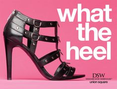
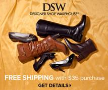
DSW’s current brand standards are completely centered around their products. Their slogan, “Where’d you get those shoes?”, puts the conversational focus right on your feet. Their logo and website design is based on a black and white color palette, allowing their trendy and colorful shoes to be the central focus. Advertisements (see examples below) typically feature large images of shoes, not always accompanied by models.

 97d9dc5393c2b1a310c7bde1045ad1b3  d76892f7cecdb6f4465373bedb866f5e_thumb

Screen Shot 2015-03-12 at 2.04.30 PM

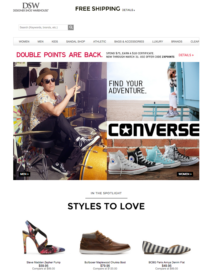
Screenshot of DSW website (dsw.com)

DSW’s advertising method is to entice viewers with the latest foot fashion trends, followed by the lure of discounted prices. This was the basis for my campaign. I chose to use stand-alone images of DSW’s colorful new sandal arrivals, taken as screen shots from the DSW website and cleaned up using the magic wand tool. I kept the rest of the color palette minimal to correspond with the ad’s destination, the DSW website. I did use a pop of pink to draw attention to certain text. 

To keep consistent with the DSW website, I used the same typography: Myriad Pro for the body text, and, because I could not find a quality ready-made logo online, I used Trajan Pro to recreate the DSW logo (as verified to be the correct font by whatthefont.com). I also created the sandals button, identical to those used on DSW’s website to direct users to various departments, to give viewers something familiar to click on and lead them to the women’s sandals department page. 

When creating each banner, I had to focus on size, margins and proportion of each piece of content so that all banners appeared balanced. The order of the content did not vary much. Font sizes were adjusted for each banner, ensuring the text was legible, correct in proportion with appropriate line-split. The “frozen toes” line is always a couple points smaller than the “open toes” line. The spring sale promotional text is formatted and sized so that it is aesthetically pleasing on the eye, with no awkward overhangs. For the images, they, too, had to be resized from banner to banner, and were realigned vertically for the taller skyscraper banner. For the button ad, only one shoe image was used and the sale promotion text dropped due to the limited size. Regardless of size, I used guide lines to ensure there was enough white space and margins around the content and that content was balanced on the left and right sides of the ads. 

Leaderboard: 728 x 90

Leaderboard: 728 x 90

Rectangle: 300 x 250

Rectangle: 300 x 250

Skyscraper: 160 x 600

Skyscraper: 160 x 600

Button

Button: 320 x 75

I also created an animated GIF of my skyscraper banner in Photoshop using the Timeline panel. I created three sets of different shoes so that each slide of the GIF would display a different set. This way, a targeted viewer would see a wider range of DSW products and hopefully be that much more enticed to click on the ad. Click on the GIF below to open in new window and view animation. 

Grunewald_DSW

A Restaurant Website Redesign using Wireframes and Responsive Design

Disclaimer: This blog and its author are not affiliated with Sitka & Spruce in any way. Designs featuring their likeness are for educational use only.


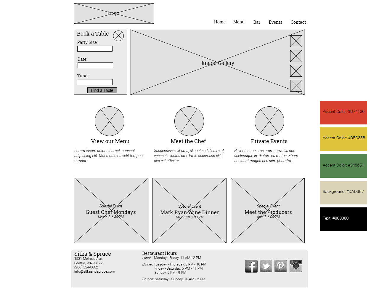
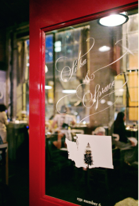
One of my favorite local Seattle restaurants is Sitka & Spruce, an intimate restaurant artfully serving seasonal Northwest cuisine,  located in a small warehouse turned chic indoor marketplace.

Image from sitkaandspruce.com

Image from sitkaandspruce.com

Everything about this restaurant is fantastic…except it’s website. Sitka’s homepage is based on an unusual horizontal scroll that is not responsive. The mobile version homepage displays only one photo at a time without any restaurant information, leaving the user with just a hamburger menu icon. That’s why I chose to redesign their website, via a wireframe, in this week’s assignment.

To model good responsive design, I organized my website in a single column with “fluid” content boxes that could easily resize and stack depending on the dimension of the user’s screen. I also created my website to be 800 px wide, considered, by some, to be an ideal size for a responsive website. I referred to Mediaqueri.es for inspiration.

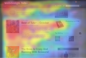
When a user purposefully seeks out a restaurant’s website, it’s typically to find a few basic pieces of information: menu, reservation information, hours and contact information. I chose to put these pieces of information in prevalent places on the website using an  F-shape layout. Based on user behavior studies, it’s been proven that users first look at a website at the upper left corner and move right across the top line, proceeding to look increasingly towards the left column and downward the further down the page they read. This means, the most important information should fall in this F shape. You can see an example of this layout below – the warmer the color, the more users eyed that specific content.

F-Shape Layout. Image from http://webdesign.tutsplus.com/

F-Shape Layout. Image from http://webdesign.tutsplus.com/

To follow the F-layout, I placed the restaurant logo and navigation bar on the top line, so the user could quickly access the information they’re looking for. I then placed the an Open Table reservation widget directly below the logo, giving the user an immediate call to action (after all, the goal is to convert the user to a customer). I placed a rotating photo gallery of food and restaurant images next to reservations, so as to further entice the user to make that reservation. 

Continuing with the F-layout, I put a linked Menu feature below the reservation box on the left, further enticing the user to visit the restaurant in person once they view the menu. Clicking on this would lead to a separate page containing the full menu. I added additional features the user might find interesting or useful, including an introduction to the chef and information on how to book a private event. I paired these links with illustrations (not photos) to match those on the restaurant’s current website, forming a consistent theme. 

Sample illustration taken from sitkaandspruce.com

Sample illustration taken from sitkaandspruce.com

I added Special Events in boxes below, creating a basic grid. Each special event header would be placed over a faded or blurred image, adding more color and interest to the page. This information would be considered less important than some of the previous, which is why I placed it further down the page. The “Events” tab in the navigation bar would also reveal this same information.

Finally, to complete the F-layout, I added a footer with Sitka’s address, phone and email, as well as their restaurant hours. I also added social media links, as most users, I think, are accustom to looking in the footer for this information. I found faded/distressed social media icons here (along with a ton of other social media icon freebies). 

Grunewald_DesignShowcase8

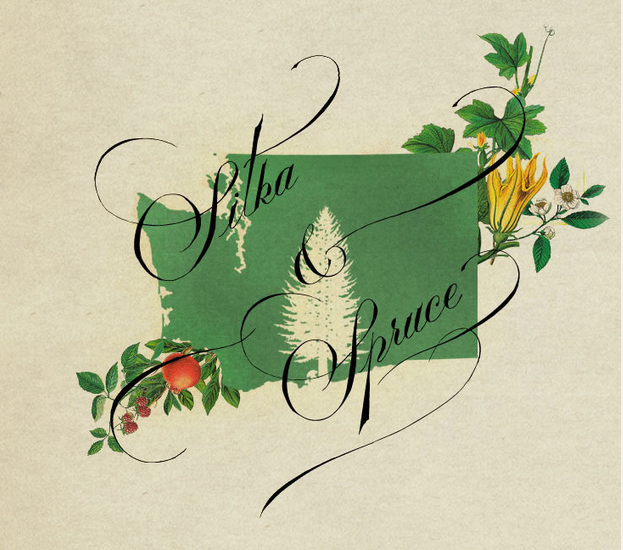
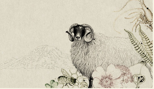
Looking forward to the overall aesthetic design of the website, I wanted to keep the current color palette, inspired by colorful, detailed nature illustrations, including flowers and animals, used on their current website. The larger illustrations  (see below) include reds, golds and greens. By keeping the same antique beige background and black text as on the current website, my redesign would provide brand consistency and not confuse users accustom to the current site. My website, however, would be easier to navigate and more functional on a variety of screen sizes. The goal of my redesign is to essentially have the design itself become invisible, shining the real spotlight on the beautiful restaurant, its cuisine and the information about them that users want and need.

Image from sitkaandspruce.com

Image from sitkaandspruce.com

Designing an original moodboard for StreetTreks.com

Screen Shot 2015-02-18 at 2.16.04 PM

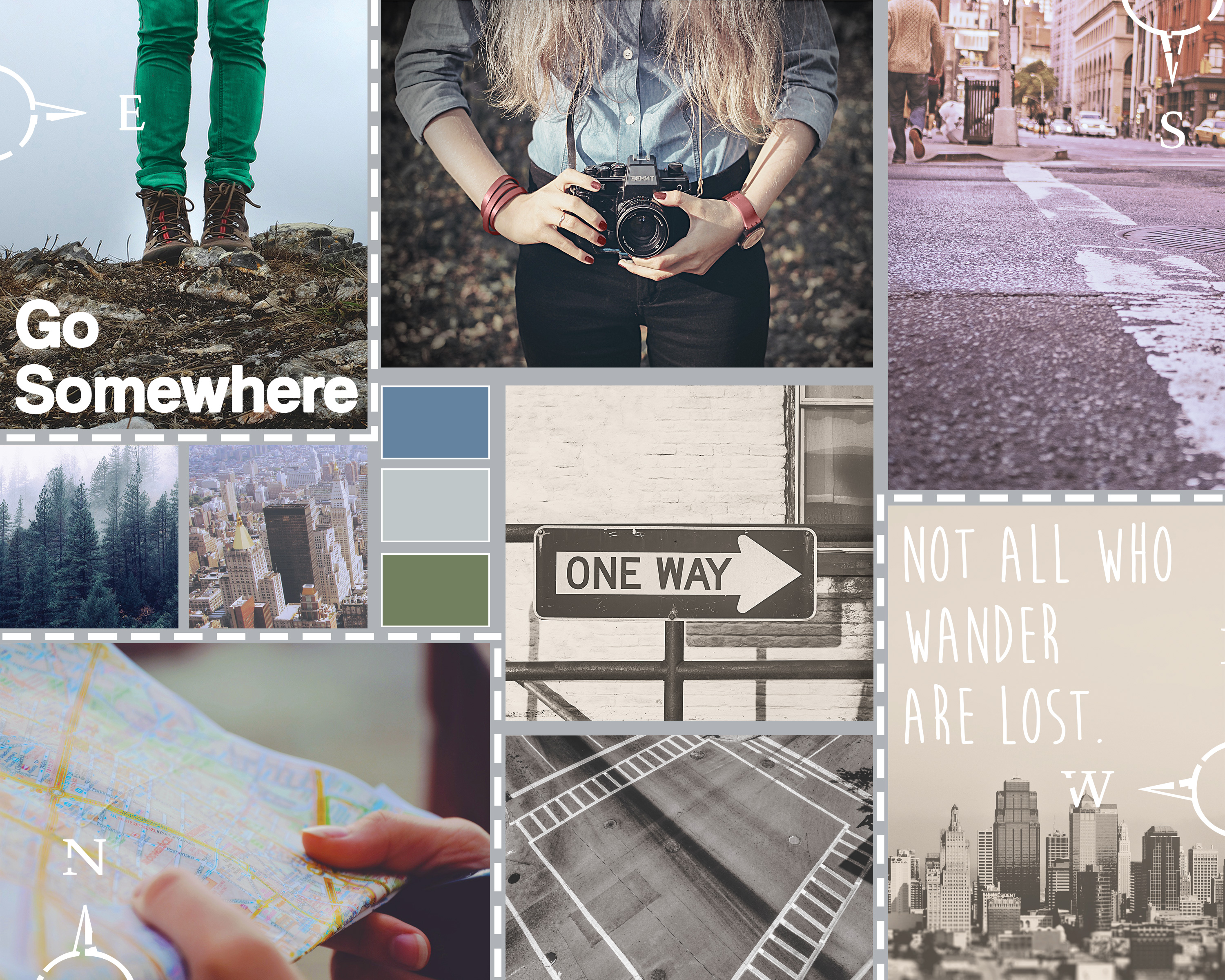
This week, I designed a moodboard for a brand/website I will be developing in another graduate class: StreetTreks.com. The idea behind Street Treks is to create a series of informative, fun and easy-to-use self-guided walking tours of a particular city so residents, especially those new to the area, can explore all of the unique neighborhoods and see everything their city has to offer. Besides promoting new experiences, my website will also promote an alternative activity to traditional hiking. While Seattle offers many mountainous trails, the city sidewalks can take you to views just as breathtaking.

Street Treks will be a website that combines both the rugged, earthy aesthetic of traditional hiking with the sleek and modern feel of the city. To convey this feeling, I designed my moodboard with a natural color palette, contrasting rustic with city images and mixing sleek and handwritten fonts.

Before I began my board, I searched for stock photography that fit my theme. I used Unsplash and pexels.com, as well as a few other resources that can be found here.
I loosely used this tutorial to help design the layout of my moodboard using the rectangle shape tool. I used my grid and guides to help with even spacing between boxes. Once I had a layout I liked, I placed my images and applied them as clipping masks to each rectangle so each box acted as a frame. Once all images were placed, I added image adjustments to various image layers as needed, including photo filters to help cool the tone of warmer images, and decreased brightness to correct washed-out images. Because my images are embedded as smart objects, I had to double-click each image to open it as a separate file, make edits and save.
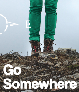
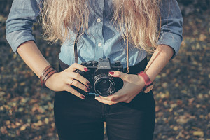
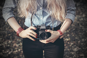
Per the project instructions, I needed to incorporate three Pantone colors of the year into my board. To add 2015’s Marsala, I selected the image of the woman holding a camera and used the color replacement brush at a high tolerance to change the color of her watch, fingernails, and bracelet. To add 2013’s Emerald, I selected the image of the woman wearing hiking boots and used the color replacement brush to change the color of her jeans from grey to green.

Pantone Colors of the Year

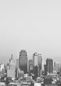
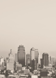
Finally, to incorporate 2006’s Sand Dollar, I took the image of a grayscale city skyline and added a layer of the color above the image using a “Multiply” blend mode, tinting the overall image.

skylinebefore

Original image

Skylineafter

Sand Dollar layer applied

The last image adjustment made was to the image of the woman holding the camera. I found a free downloadable Photoshop action called “Portrait Action” and applied it to my image. The action helps desaturate an image and comes in two parts. A couple steps must be manually done in-between Parts 1 and 2 as indicated in the instructions.

cameragirlmarsalabefore

Original Photo

cameragirlmarsalaafter

After Color Replacement and Portrait Action

I added two sets of text, one in modern “Coolvetica” and the other in handmade “Moon Flower Bold,” both free from dafont.com. I purposefully tried to create a contrast by placing the more modern font on a rugged image, with the rougher handmade font on the modern city skyline. I also added a few dashed boxes and compass custom shapes to make the board more interesting and balance the white text. Finally, I added a color palette sampler that I felt reflected both the natural and city beauty of Seattle.

I like to think my final moodboard conveys to the viewer the StreetTreks.com goal: to take the scenic and woodsy activity of hiking and apply it to the city you’re already living in. A forested mountain hike isn’t always close by, but a city hike, exploring new neighborhoods and discovering new viewpoints, can be right outside your front door. So bring your camera, and your map (to be provided digitally by StreetTreks.com, of course) and start trekking!

Grunewald_DesignShowcase7

Understanding Logo Design … in (gasp) Photoshop!

This week, we learned about logo design. Although logos are traditionally created using Illustrator, my instructor brought up a great point: what if (gasp!) you don’t have access to Illustrator? It was certainly a unique challenge but once I had my idea, I bootstrapped Photoshop to make it work.

We were given a choice of client and I chose “Company B”: A non-profit based in Los Angeles dealing in green initiatives and looking to partner with local businesses to spread awareness. After playing with a lot of different word combinations, I settled on the name “Conserve California.” 

We had overall freedom over the logo design, however we had to include at least one logo mark provided by my instructor. I decided on a combined logo mark and typographical mark, with the logo mark being an image of a tree. I decided on a tree because the image automatically symbolizes the environment. I selected a fragmented ball shape from the logo marks provided to be the leafy top to my tree. The ball just so happened to be green, a color symbolizing health, and in this case, the healthy environment my client is trying to create and preserve. The many different shapes in the mark could represent all the different initiatives my client works on.  Also, Los Angeles is notorious for smog, so a leafy green tree is the ultimate symbol for clean air.  Overall, I decided a tree would not only be an appropriate symbol, but one that is simple and with timeless meaning.

Logo mark tree

Chosen logo mark from those provided

Because the logo is for print and web, I worked with a 7” x 5” canvas at 300 dpi, to keep the image crisp. This resolution is too high for the web, but Photoshop’s “Save for Web” option helps to correct for that.

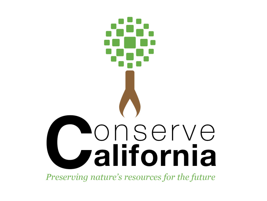
I wanted to use Photoshop’s vector graphics as much as possible when designing my logo so that it could be easily resized without losing too much quality. For this reason, I relied mostly on custom shapes. After cropping and clearing the background of my selected logo mark using the magic wand tool, I got to work on the tree trunk and roots. I very much enjoy logos that have hidden symbols (such as the FedEx hidden arrow (see more of these logos here)) because I feel the designer spent extra time thinking about how to make the logo more interesting. For my tree trunk, I used a rounded rectangle and a water drop shape in brown to form the trunk of the tree – the brown color being in the same tone as the logo mark’s green. I then placed a smaller white water drop shape inside the base of the brown one, creating (on a white background) the appearance of curved tree roots. The white water drop essentially becomes the hidden symbol – hinting that my client not only focuses on clean land and air, but also water. When it makes sense, I figure the water drop could be recolored to the color of the background if not white (but not black since that would imply dirty water).

Logo Tree

My tree logo mark – see the hidden water drop?

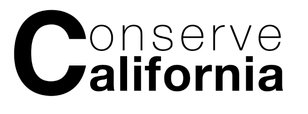
For the word mark portion, I used modern sans serif fonts with clean lines to reflect my streamlined tree: free font, Coolvetica, from dafont.com (a bit more of a modern take on Helvetica) and the thin version of Helvetica Neue. I used the thin font for the word “Conserve” because by the letters being thinner, you are literally conserving ink when printing.

Since my tree is vertically oriented, I decided to follow that direction by placing my word mark below the tree (however it could go to the right of the tree if a horizontal orientation is needed). I chose to share one letter ‘C’ between the words ‘Conserve’ and ‘California’ for two reasons: stacking the text in this way offers a contemporary feel (I adjusted the leading and kerning to align them just right) and by using just one ‘C’ instead of two, you are “conserving” C’s. This represents saving natural resources since ‘C’ is the chemical element for carbon and reducing carbon emissions is a hot topic in the green industry.

Conserve California word mark

Typographical mark

I created a tagline I felt would encompass all of my client’s green initiatives, current and future, by not focusing on one specific campaign, but on my client’s overall goal: “Preserving nature’s resources for the future.” I believe my logo is general enough for use in the green industry in order to stay relevant, even if the tagline changes.

Conserve California Logo Mock

Realistic-Business-Card-Mock-Up

Since my logo is fairly simply and uses smooth typography and minimal colors, I believe my logo will work well in a variety of formats, including in small form on business cards, on the web, embroidered on shirts, on a dark background or in grayscale. I resized my logo to a very small size to see what it would look like and I think the tree by itself would be effective as a favicon or app icon.

Logo Reverse Background

Logo on reverse background

Logo Grayscale

Logo in grayscale

As long as my client’s business stays within the realms of the green industry, I believe my logo would hold up, however outside of that, I’m not sure if the meaning behind the tree symbol would carry. Their company name is “Conserve California” so if they do decide to conduct business outside of the green industry, I’m sure they’ll need a complete rebrand, not just a new logo.